Talking with Steve Toutonghi about all the work a book cover has to do
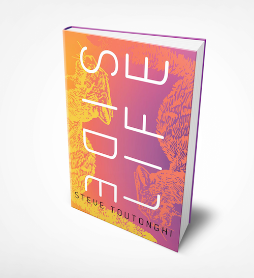
Next May, Seattle author Steve Toutonghi is publishing his second novel, Side Life, with Soho Press. Today, Toutonghi and Soho are exclusively sharing the book's cover with Seattle Review of Books readers. (That's it right up above this paragraph.) The novel — about a discouraged internet entrepreneur who takes a demeaning job as a housesitter in a billionaire's tech-haunted mansion — has to convey a lot of information in its cover: it has to look futuristic but not too distant, it has to convey the sense that it's a thriller, and it has to stand out from all the rest of the books that will be coming out next year. I talked with Toutonghi about the process of creating and choosing a cover for a book, and what kind of work he thinks a successful cover has to do. This interview has been lightly edited.
Our readers are very interested in the relationship between writers and the covers of their books. I think people tend to believe that authors have a lot of control over that process, but most of them don't. Tell us what the process was like for you. This is your second book, and it’s your second with Soho Press, right?
Yeah. I'll start with the last book, because I think it may have influenced how things went with this one. I really didn't have much of an idea of what to expect that first time. I received a proof of the cover and I loved it, and I wrote back to Soho that I loved it, and that was pretty much my degree of involvement in the cover design, which was fine with me.
With this one, when I received the cover file I thought it was just an incredibly smart interpretation of the content. I had some conversations with booksellers about the function of the cover in different contexts, and so I had a question I wanted to raise with the publisher, and I said, "What about this thing that I heard might be a concern for booksellers?" And then they took my concern into consideration.
And a couple weeks later they sent the new proof of the cover — it was same concept, but I had asked a question about the colors that were used, and they adjusted the color. So all in all, it was a very positive experience. Certainly, they listened to me, and they took it into account. But they, you know, started the design process and sort of walked through the initial context and all that stuff without me, I didn't have visibility into that. The things that I did get were really polished, professional, very smart takes on the content of the book.
So I was happy with the process, but I didn't have a lot of sort of early input into it, which was actually probably the right thing to do because they know what they're doing. Covers are really complex — they're doing a ton of work. The designers who work on them have worked on a lot of projects, and the people at my publishing house do a fantastic job. I'm more than happy to have the kind of experience that I had with them. It felt like a very, very much the right degree of influence for me.
Yeah, writers are not necessarily great at visual communication. Often I think what a writer senses a good cover might be is a little bit distorted. Are there any covers of books that are not your own that you really enjoy? And, conversely, are any covers that have always bugged you as a reader?
Honestly, you know, there's this whole kind of line of covers that are using conventions of genre. To me, they’re covers that seem cheesy or not all that interesting. But in a lot of cases the people building those covers are talking with an audience that I'm not really used to communicating with, so I don't know really what they're doing. I feel a little reluctant to pass judgment on them. I'll look at a cover and think, "well, I'm not super-excited about that," but that doesn't necessarily mean the designer didn't hit their marks or do the thing that they were trying to do.
Right, there's a common language in genre covers that fans understand. Your publisher Soho is in the mystery space, but their books don't look like the covers of a lot of mysteries and thrillers that are out there, right? Their books certainly don't look like the sort of thing that you think of when you think of Sue Grafton or, you know, The Girl with the Dragon Tattoo.
Yeah, I agree. I don't know if you've seen their Soho color map? They have a poster that they printed in 2016 where they had their mystery authors aligned by color. The point of the poster was showing that they had this large library of very high-quality mystery writers and their design process had resulted in enough similarity to show them as a library with a coherent visual identity. One of the ways that they're doing a really incredible job is through their focus on high-quality design and doing things right.
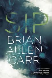
There’s a book that's coming out from Soho shortly, Sip by Brian Allen Carr. I think that's a beautiful cover. I love the way that the title is sort of partially obscured by the smoke, and I think it's very elegant and also a little threatening. Also if you read the synopsis it seems appropriate for the content. I haven't read the book, but -
[Reading the synopsis] “…the highly regimented life of those inside dome cities who are protected from natural light…,” OK. That makes sense.
And people drinking their shadows.
Yeah. That looks very appropriate, and in the hands of another publisher, I bet it would be more genre-y. Not that there is anything wrong with that.

Yeah, and I think if you want to go into action, they also have Robert Rapino's books. Those books have, I think, a really striking visual identity that's really clear and that speaks, I think to sort of the precision of the concept. The animals get smart and attack the humans and fight with each other. The covers really speak to the big-concept clarity of the world he's creating.
They're very sort of cool and futuristic.
Yeah, but isn't it interesting how it can be cool and futuristic, and also just a cat's face?
Yeah.
I like that. I love that. And then diverging from Soho, there's a lot of really cool things happening from Viking books. What they did with the redesign of the Murakami books — I think those are really cool.
They fit altogether in sort of a unified graphic, which is crazy, and the elements kinda spill off one cover and onto another.
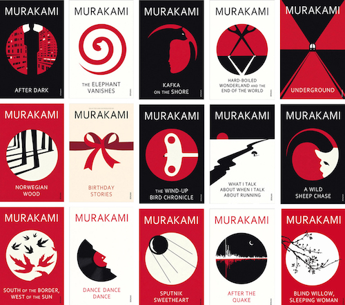
I hadn't seen them like this all laid out together like that. Yeah, that’s kind of a dream for an author, right?
I think so.
When I started reading novels, there were the Vonnegut covers with the giant "V." They don't really have much of a graphical element on them, but that's how I read through Vonnegut. I would look for those books and find them and read them based on their covers.
That’s an interesting example, because I know exactly what you're talking about. My mind immediately calls up an image of them.
So bringing it back to your cover for a bit, you said you got some advice from a bookseller on the new cover. Can you talk a little bit about what the bookseller's input was?
I'm just going to talk generally about conversations I've had with booksellers about covers, and not specifically about the covers of my books. So, for example, I'm used to going to a bookstore and I'll see a cover — the spine of a cover, or the cover's facing on a shelf. Booksellers talked a lot about the cover existing on a table in the context of a bunch of other books, which was something I hadn't really thought very much about. And you know, the facing cover on a shelf is in a different context because it's likely to have spines on either side of it. And then, you know the spine is another context. But on the table, you want a cover that's going to pop a little bit, that's going to suggest that a person browsing the books on the table pause and pay attention. You want something that won't wash out.
One of the booksellers talked a lot about how he liked the covers to have some kind of internal color tension, so that it didn't rely on tension being established by books next to it. Because colors in the publishing industry sometimes move cyclically. So, a certain pallette becomes widely used, and then there's sort of a movement to another pallette.
Oh yeah, that's totally true. I think last year at this time bright yellow was in vogue — you would just go into a bookstore and there would happen to be like five bright yellow books on the front table at a bookstore. And it's not coordinated, obviously. Nobody wants their book to look like everyone else’s, but it's just one of those weird things that happens with fashion and design where people follow trends without even realizing it.
Yes, and so he was saying, “look, you're going to run the risk of that happening. So try and create some contrast on your cover, so that if you get into that situation you don't lose the browser's eye as they pass across the cover. I thought that was interesting.
It seems like there a lot of conversation about the degree of legibility — there's a tension between the legibility of the text and the freedom of graphic design that the designer feels that they can explore as a way to express the emotional content and emotional relationship with the book. I think that's really interesting — how the designer approaches the idea of legibility versus the emotional design.
Can you talk about where you think the cover of your new book resonates with the story?
The story has a note of urgency, but it is also set in a very familiar context. And so they did this really wonderful thing with the colors. The colors are kind of bright and they pop and the title is two really simple words, but they’re arranged in such a way that there's this nice tension. So I feel they did a really good job of connecting the design and the content of the story.
And then there's cats, which provide familiar context and are potentially comforting. But the cat in the story has a really specific role, and I think it's nicely reflected in the way that the cat appears on the cover.
I'm sort of at the edge of my seat to see what will this look like in the context of a table at a store.
Another thing that I like about that cover is the text is sort of large and bold, but also part of the overall composition in a nice way. So the cat and the colors become kinda abstract as you shrink down to Goodreads size. For me, I feel like it's successful at communicating that sense of tension and familiarity at the various sizes you’ll see the cover in. It's important to do that.
That hadn't even occurred to me: the different ways covers are presented these days. You've got to communicate the book’s contents on a table with a bunch of other objects. You have to communicate it as something that belongs on somebody's shelf at home, but you also have this postage stamp size that's got to grab people's attention on social media. That's a lot of levels.
It really is. There's so much going on. There are so many moving parts that as an author, it’s really useful to me to feel comfortable that I have people who are experts, who have experience, and who have a track record advocating for their concerns in the design process.
It's like this crazy, very complicated moving target, and it's amazing how many beautiful covers are out there, given all those constraints.
Share this interview: