Archives of Thursday Comics Hangover
Another take on Short Run
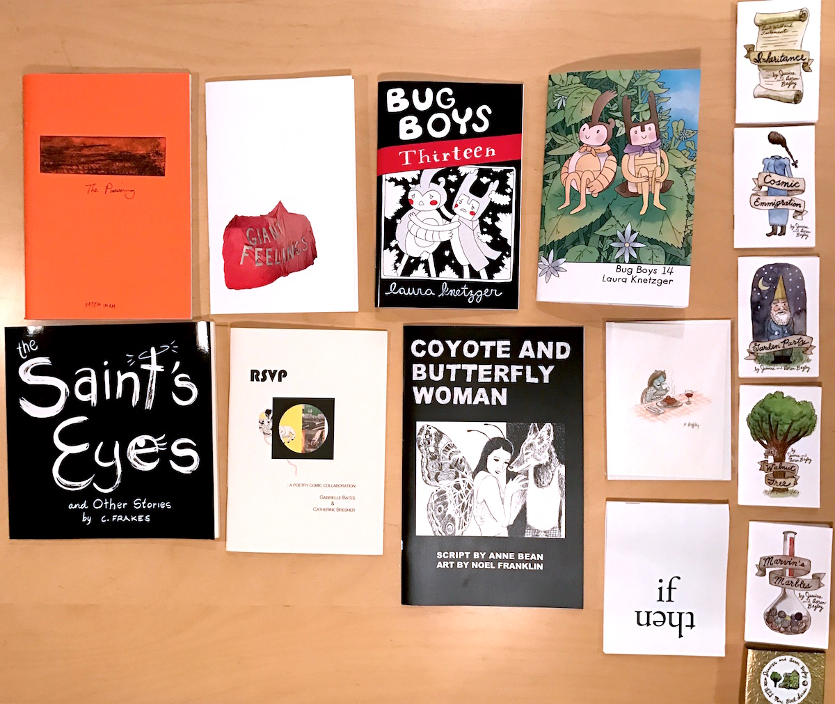
Short Run Comix & Arts Festival was packed this year. There were quite a few booths I had to skip because of people eagerly blocking them. This is good — I was there a few hours after opening, and more than one artist I talked to spoke about being sold out of some items.
My favorite from last year, Laura Knetzger was back with a few new issues of her delightful comic Bug Boys. One of the stories, Issue Thirteen, was a kind of inner-journey psychedelic bug nightmare. It was a dark-night of the bug soul and a kind of peyote journey in the bug desert. In Issue Fourteen, Stag-B and Rhino-B accompany their friend the Bee Queen on a journey. Kntezger loves to put her bugs in underground contained architecture, placing them in situations of awe and fear, and evoking their truest natures. I find her work a great balm of philosophical thoughtfulness, and I’m always pleasantly surprised when her little heroes stumble on a new adventure.
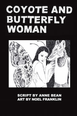
Like Paul (our time at the festival overlapped, but we didn't see each other), I picked up Coyote and Butterfly Woman from Noel Franklin and Anne Bean, and appreciated its modern retelling of an old legend, especially for its Seattle setting, its tragic explanation of masculinity sadly pertinent this very week.
Hatem Imam, from Beirut, had a few interesting pieces in his booth. I picked up The Passing, a four-part story told largely in engravings and minimal text. The cover of each book was an intaglio copper-plate etching from the last story in the book, a nice tactile treat, and a very sober, serious presentation.
I said hi to Aaron Bagley, and picked up a set of small comics that he produced with his wife Jessixa Bagley, telling fictionalized mythologies centered on his parents house in Utah. I also bought one of his hand-illustrated greeting cards, a cat in a polka dot dress taking a picture of her spaghetti and meatballs dinner. (Secret about Aaron: he has a vast knowledge of outsider metal. If you like the heavy stuff, he always has good tips for obscure Japanese drone bands.)
I picked up the Colleen Frakes The Saint’s Eyes, fairy-tail(ish) shorts that were clever, often with fun or funny little twists at the end, and looked through her NaNoDrawMo book as well, which was interesting and fun and now I wish I had picked it up as well.
Emily Eagle had a great table, with many little projects, and a big print in simple blue hand-done type that read “this means your heart works”. I picked up her Giant Feelings, which is also her URL, and kind of perfect.
I walked away with (I paid, I promise!) a copy of RSVP by Gabrielle Bates and Catherine Bresner, what they call a “Poetry comic collaboration”, and that’s true. The art is primarily collage, and echoes some kind of Americana DNA that it was good to see conjured for uses of art.
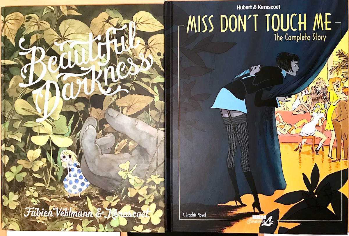
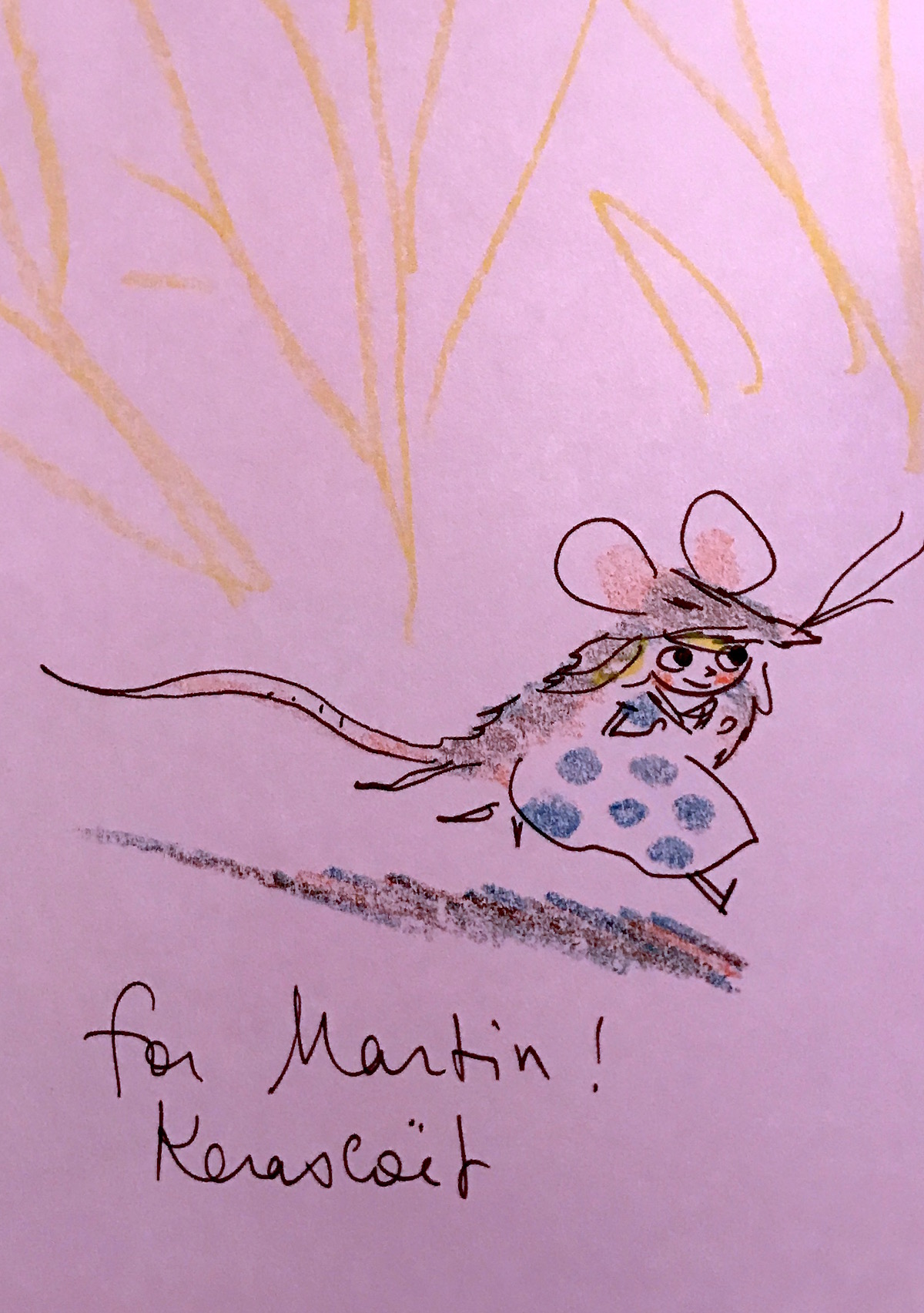
Probably my favorite pieces I bought this year were from French artist Kerascoët, which is the pen name of married couple Marie Pommepuy and Sébastien Cosset, who manned the booth together. I sought them out after the recommendation from a friend, and I’m glad I did. Miss Don't Touch Me is a story set in the 1930s, a woman investigating a murder of someone close to her by joining a high-end Paris brothel as a never-to-be-touched dominatrix. The other, the Eisner nominated Beautiful Darkness, starts with fairy-like creatures emerging from the corpse of a dead girl in the woods, a horror countered by the cuteness of the characters.
When I first came to their table, the man in front of me, blood draining from his face, said "Wait, you're her…them? I'm a huge fan!" It was as if he had just met a Hollywood star. Marie took the time to draw beautiful inscriptions on both his — and my — books, which was worth waiting for. Crayon, pen, and characters, an artist drawing something for you right there at the table. Isn’t that what it’s all about?
Thursday Comics Hangover: The best of Short Run 2016
Pre-election anxiety kept me from enjoying my Short Run Comix & Arts Festival to its fullest on Saturday. Last year, I wandered the floor for hours and talked to dozens of people. This year, I could only hang on the sidelines before diving into an aisle for a few minutes and then, overwhelmed by the crowds, retreating again. (Luckily, thousands of people were there to pick up my slack: it seemed as though there were even more attendees at this year’s Short Run than at last year’s, and social media seems to indicate that most of Short Run’s artists sold more books than any other year of the festival.) Because of my inability to mingle for very long, I came away from the festival with a very small stack of local comics. But it was one of the most satisfying hauls I’ve pulled away from any Seattle-area convention.
Frequent collaborators Greg Stump and David Lasky each brought new work to the show. Stump was selling a collection of The Group, his 2001 and 2002 comic strip from The Stranger (“back when they had two whole pages of cartoons an issue,” someone grumbled.) The Group is the story of an unlikely team of heroes — an astronaut, a ninja, a dog, and Piece of Bread, a sentient piece of bread — who fight various challenges to world peace, including a devious plot to build a giant cowboy hat on top of the world. Piece of Bread makes some protest signs to stop that plan — “NO HAT” and “STOP THIS LUNACY” and “HAT PLAN SUCKS” — but the rest of the team is reconsidering their options. “Sure, we had our doubts at first,” the ninja explains, “but now I think I’m kinda pro-giant-hat-on-the-earth.” These are good, absurdist gag strips that had nearly been lost to the mists of history; seeing them again after 15 years was an absolute delight.
Lasky’s newest book, I am from the Future, collects every poem Lasky wrote in April of 2016 — one poem each day. As a poet, Lasky is expanding and finding his voice. He writes about cosplayers at Emerald City Comicon, buses that never show up, and confusing Facebook algorithms. Some of the poems in Future are comics, and others are presented in text. It’s the comics poems that really stand out, particularly the one on the back cover about the lines in his comics disappearing, leaving just “The colors in between” — floating pools of color with no borders to keep them separated from each other. The text and images work perfectly together to create a metaphor that could not exist solely in either words or pictures.
The second issue of Punch to Kill, by Kevin Clarke, Wil Long, and Marc Palm, improves on the over-the-top action of the first by introducing gaudy superheroics to the equation. While Punch to Kill is, appropriately, one long fight scene, the transition from the kung fu movie of the first issue to the 1980s-style comics riff of the second adds even more enthusiasm. There’s not really a plot in Punch to Kill — in this issue, a cloaked figure fights a quartet of thinly veiled Marvel characters — but the plotlessness, in a judo-flip kind of way, becomes the plot. It’s all giddy and gorgeous and packed with good jokes, like a superhero named Blastress and a punching sound effect that reads “TOUGH BREAK.”
And speaking of exuberance, two books from Mita Mahato’s table demonstrated a very different kind of excitement. Her latest solo book, Patterns, is a collage of comics characters (an elephant-headed girl, a spoon-headed figure with a pizza cutter sticking out of the bottom of her purple dress) failing to communicate. “Repeat after me,” a horse-headed girl tells a man in a pleated dress, who responds, “after me.” It’s part vaudeville, part demonstration of how hard it is to really talk and listen, and it’s entirely beautiful.
But maybe the star of the whole convention for me was Forty Two, an anthology comic by Mahato, Emilie Bess, and Short Run cofounder Kelly Froh. Forty Two is a collection of short pieces about becoming middle-aged women — there’s a lot of accidental urination involved, and also some weird body hair. Mahato reflects on how difficult it is to be a woman of color “watching brown people on TV growing up” — mostly stereotypes like Tattoo from Fantasy Island — and recalling some of the terrible things people have said to and about her, including “You’re not the kind of diversity people are interested in,” and “Mommy why is she so dark?” Each of the pages in this fanzine-style collection reveals something new about the act of growing older as a woman, and the three cartoonists goad each other into having a lot of fun. Forty Two seems to me to be the perfect use of the zine medium: it feels like a personal document, like a handwritten letter. It’s so confessional, and so fun, and so celebratory, that it can pick a reader up even when it feels as though the world is burning down. These are all voices that deserve your attention.
Thursday Comics Hangover: Doctor Strange could be a little more strange
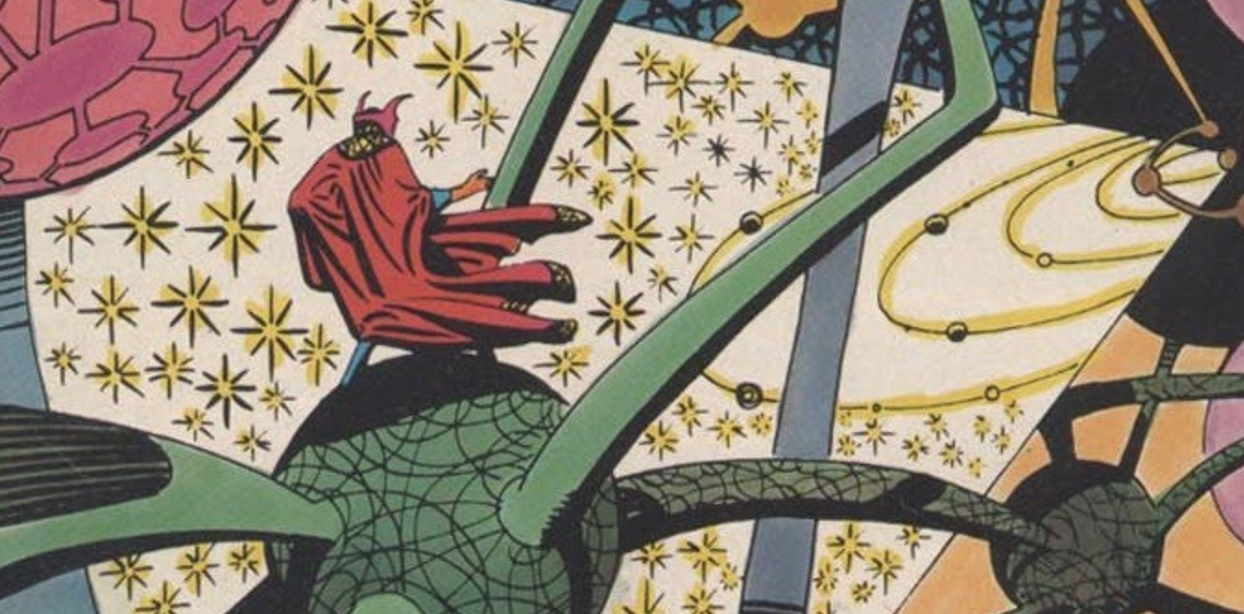
Yesterday was comics artist Steve Ditko’s 89th birthday, which made it an especially fitting day to watch a preview screening of Doctor Strange. Ditko was the co-creator of the Doctor Strange character, and those early comics, published in Strange Tales in the mid-1960s, were probably the purest example of Ditko’s imagination ever put to paper. Strange frequently ventured to realms where giant creatures made of spikes would crawl out of pools of liquid floating in thin air, or where thick bands of ink formed protective barriers that would keep astral forms — essentially, the souls of humans — trapped away from their bodies.
The great thing about Ditko’s illustrations of magic in Doctor Strange comics is that they were basically marginalia pulled into the story — an artist’s mindless doodles given weight and narrative meaning. They were creative id made real. And in many ways, the special effects in Doctor Strange serve the same purpose as Ditko’s illustrations. In a few instances — particularly the multicolored sphere-and-rod molecular structures of the Dark Dimensions — they look exactly like Ditko art made three-dimensional. But in every instance, the special effects aren’t intended to look realistic: they’re concepts, digital doodlings, attempts to make bizarre concepts real.
The pulpy psychedelia of the early Doctor Strange comics are served well by the effects in the Doctor Strange film. A series of fractal hands and bizarre facial contortions early on, especially, capture the stoner vibe of Ditko’s art. And even the bits that feel familiar — you’ve likely seen the kaleidoscopic cityscapes in the trailers for the film, which feel like direct lifts from the iconic city-bending scenes in Inception — still take the source material to bizarre new lengths. Speaking as someone who has been thoroughly disappointed with just about every blockbuster film this year, it turns out that digital effects can be incredible when you don’t obsess over realism. This is a movie to watch on as big a screen as possible, and IMAX 3D is recommended. Your eyes will be happily exhausted trying to take it all in.
But it’s a shame that when Doctor Strange isn’t aping Ditko’s visual style, it’s mostly a very conventional superhero origin story. The origin that Stan Lee and Steve Ditko took eight pages to tell in Strange Tales #115 is stretched out to two hours here, and the Marvel film house style is basically in full effect. The score is unmemorable, a black sidekick character with similar powers accompanies the white male hero while still staying firmly in a supporting position (Chiwetel Ejiofor has almost never felt so wasted as he does in Doctor Strange), and the villain (Mads Mikkelsen) doesn’t get to demonstrate an interior life. Further, the story stops dead for massive exposition dumps on a regular basis, and given that the magic in Doctor Strange involves lots of chatter about spirits and the meaning of life, the effect can be similar to attending an overeager new-agey church for the first time.
That said, Benedict Cumberbatch is a fine and charismatic lead who does pretty well with the American accent and the same “overconfident jerk learns humility” arc that Iron Man and Thor and Chris Pratt's Starlord in Guardians of the Galaxy followed. Rachel McAdams and Benedict Wong don’t have much to do in supporting roles, but they excel with what they’re given. In an unfortunately whitewashed role as the guru who shows Strange the ways of magic, Tilda Swinton elevates the film whenever she’s on screen.
Is Doctor Strange worth your time? I’d say absolutely, if just because it’s a delight to watch a blockbuster that finds inventive uses for CGI, rather than just rendering an endless array of explosions. It’s a likable, enthusiastic superhero movie, with all the baggage and all the entertainment that description entails.
But is Doctor Strange worthy of Steve Ditko’s art? On the whole, I’d have to say no. While the effects are marvelous, Doctor Strange fails to capture a particular alienated bitterness that almost always figures into Ditko’s work. His Strange was a wary, weird figure who didn’t connect well with normal humans. Instead, he sulked around his Greenwich Village home, wandered through weird dimensions, and spent lots of time with his head buried in books. While the look of the film is dead on, Doctor Strange could use more of Ditko’s characteristic misanthropy to distinguish the character’s otherness from the alpha-male heroes who have already come before. This Doctor Strange is not strange enough by half.
Doctor Strange opens in theaters all over Seattle tonight.
Thursday Comics Hangover: The city gone by
When I was younger, I didn’t really understand the appeal of Ben Katchor’s strip Julius Knipl: Real Estate Photographer. It has always been easy to see that Katchor is a talented artist — every panel is a beautifully composed portrait of urban life, every person in each panel has their own unique personality and history. But something about the strip resisted my attentions. I couldn’t find a character to identify with in Knipl, or any situations that spoke to me. I chalked it up as one of those rare strips — Prince Valiant is another — that is clearly of high quality, but which never really grabbed my attention.
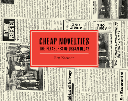
Drawn & Quarterly just reissued the first real Knipl graphic novel from Katchor. It’s titled Cheap Novelties, and it’s a beautiful book, designed to look like it’s been wrapped in old newsprint, with the strips reproduced in a larger-than-life format. I thought I’d give it another try, as I’d done on multiple occasions over the years, just to make sure Katchor’s work still didn’t work for me.
Every once in a while, a reading life suddenly shifts dramatically, and a once-impenetrable work of art instantly melds with your subconscious. That’s what reading Cheap Novelties was like for me. From the very first page, I immediately understood the point of the Knipl strip, and of Katchor’s work. I eagerly read Cheap Novelties and found myself wanting to reinvestigate all of Katchor’s books.
The thing I had never quite understood about Katchor’s strip is that the city is the main character. Every page in Cheap Novelties is about some strange aspect of city life: a failing chain of flophouses, the diminished prominence of kosher slaughterhouses, the variety of paperweights used to hold down newspapers at newsstands. They’re little tributes to disappearing aspects of city life, some real and some fictional.
Katchor works at the boundaries of nostalgia and the black hole of memory created when something disappears from our shared experience. I’ve heard plenty of people reminisce fondly about the simple and immobile analog pleasure of landlines, for example, but very few people can remember the satisfying heft of carrying a desktop phone in their hands, or the weird, voyeuristic frustration of sharing a party line with their talkative neighbors. You don’t long for the disappearing city that Katchor documents in Cheap Novelties, exactly, but you do want to acknowledge it, to pay it tribute somehow by bearing witness.
In one strip, a movie theater removes its large marquee and replaces it with a smaller, more stylish sign, we are informed, “in an effort to look modern,” and “to save on electricity,” and “to be taken seriously,” and “to be tasteful,” and “to improve the block.” Our hero, eager to watch a film, walks right by the marquee-less movie theater without noticing it. “I thought it was around here…must be farther,” he mutters to himself. “Maybe those lights in the distance.” The name of the theater (The Bosporus) and the film (An Autopsy for Two) are just extra punchlines on top of the poignant vignette.
Cheap Novelties doesn’t aspire to make cities great again, and it’s not interested in wallowing in the past, or whitewashing history into something wholly admirable. But in every strip, Katchor is throwing a wake for some quotidian urban object or another, admiring them for the purpose that they served, even as he acknowledges that the world has moved on. If you’ve never appreciated the appeal of Katchor’s work, I urge you to give Cheap Novelties a try. Katchor admires and celebrates a city that has suddenly become irrelevant, and his work has a way of suddenly finding a new relevance when you’re ready to see it.
Thursday Comics Hangover: Vigilante justice
Unlike a lot of male superhero comics readers of my generation, I’ve never been a fan of the Punisher. I always preferred my superheroes to be aspirational. Murdering criminals in the street is something that only criminals do. The Punisher, to me, has always demonstrated the ugly, conservative side of superheroes, where the bad guys are an other—monstrous, irredeemable, worthy of nothing but scorn.
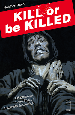
In the third issue of Kill or Be Killed, the protagonist, a young man named Dylan who is haunted by visions of demons, has killed his first criminal. Dylan believes that he’s made a deal with the devil — that if he doesn’t take a life, he will die — and so he chooses a criminal whose crimes have gone unpunished as his victim.
Dylan is about as unreliable a narrator as you can find in modern comics, and his narration pulls the reader in uncomfortably close. It’s like being pinned in on the bus by someone who insists on sharing their unpleasant worldview with you. Here, Dylan revels in his first kill:
It was almost like I’d peeled away a layer from the world, and I was more now… More than other people…. Last night, before I fired that gun, it felt too powerful in my hand. Like it was going to fly out of my grip or explode when I pulled the trigger. But now I don’t feel that way. I’m not so weak and full of doubt anymore.
Dylan spends much of the third issue with a young woman named Kira, trying to seduce her away from her boyfriend even as he revels in his newfound power. The reader can’t help but want to tell Kira to run; unlike series like The Punisher with muddled morals, there’s never a second of doubt in a reader’s mind that Dylan is anything but a danger to everyone around him.
Brubaker and Phillips have been making comics together for a long time now, and Kill or Be Killed is a work of supreme confidence. The comic feels dense, like a chapter of a novel, but Phillips still has plenty of opportunities to show off his hyper-detailed artwork. It’s rare to find a writer and artist who have achieved this kind of a tight symbiosis, who bring out the best in each others’ work on every single page.
And colorist Elizabeth Breitweiser’s palette for the book is another subtle nudge into Dylan’s decaying mind: every person looks a little bit grey, like they’re sick, or rotting from the inside. Only a few flourishes like the red of Kyra’s hair breaks the monotony of Dylan’s universe, and the few threats of violence in this issue pop out with bright colors. Forget the opportunities for love, or the distraction of sex — the violence, the promise of murder, is the only thing that brings Dylan, however momentarily, to life. He’s a sick, violent man who looks at the world and sees something as sick and violent as he is. Worse, he believes he’s the only one who can do something about it. This story cannot have a happy ending.
Thursday Comics Hangover: Doom, again
Sometimes you just fall in love with an artist’s work at first sight. That was what it was like for me reading the first issue of DC’s new Doom Patrol, which was published last week. I don’t know where Nick Derington comes from, but that two-page spread he drew that opens the issue, with a long, narrow panel of protagonist Casey Brinke driving an ambulance, is this kind of a moment for me. Derington has everything I love in an artist: simple lines, fine details, expressive facial expressions. This is the same kind of feeling that hit me when I first saw Marcos Martin’s art, for instance: pure love.
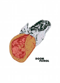
I wish I could say the same for Gerard Way’s script. Way, the rock and roll singer who wowed comics fans with his weird superhero series Umbrella Academy, is launching a new weird adult imprint for DC Comics called Young Animal, of which Doom Patrol is the flagship title. And several of the new characters that Way introduces in the book — Casey Brinke, a singing telegram girl from beyond the stars — are absolutely fascinating. But only part of this book is treading new ground.
In a text piece at the end of the issue, Way talks about his love for Grant Morrison and Richard Case’s Doom Patrol comic from the 1990s. While that Doom Patrol run was absolutely incredible — I recently re-read it and was happy to find that much of it holds up — some of the elements in this new Doom Patrol feel a bit too eager to retrace those steps. The beauty of Morrison’s run on Doom Patrol was that he took an old, unsettling superhero comic and transformed it into something new and unsettling. It was of its time, and it happily discarded elements of the past to build its own identity. If Way is unable to make something new here, his Doom Patrol could wind up being nothing more than a nostalgia act.
Comics is not hurting for nostalgia; in fact, nostalgia is what is holding comics back. And those terrific books that ran during the heyday of Vertigo Comics — Doom Patrol, Animal Man, Sandman — deserve more than nostalgia. The best homage Way could pay to Morrison’s run would be to ignore it, and to head in a different direction entirely.
Thursday Comics Hangover: They put a man on the moon
If you love books and you haven’t read cartoonist Tom Gauld’s terrific collection You’re All Just Jealous of My Jetpack, you’re missing out. The book is packed with clever riffs on genre and famous authors, demonstrating Gauld’s deep reading life and obvious wit. He’s one of us, it announced to book nerds, and he’s not afraid to show it.
Gauld’s newest book, Mooncop, is totally different: it’s a single comics story, a(n admittedly slender) graphic novel that couldn’t be more rhythmically opposed to the compact gags of Jetpack. It’s the story of a police officer on the moon, years after a lunar colony’s glory days. Gauld takes his time with the story, eschewing the quick gags of Jetpack to draw many swaths of large silent panels to set the desolate scene. The humor in Mooncop is quieter, sadder, more humane.
And as a cartoonist, Gauld has never been stronger. The figures in Mooncop are still cartoony, with simplistic faces behind circular astronaut helmets and pipe-cleaner-bendy limbs. But the detail he packs into each panel is gorgeous: the empty landscape of the moon is made up of thousands of tiny wiggly lines, a sea of stone set against an indigo sky.
The title character in Mooncop, who for the sake of expediency I’ll just call Mooncop, is a hapless fellow, a lonely man who’s left to police the dwindling lunar population. Just about everyone else has moved back to earth. “Living on the moon,” an elderly woman muses to Mooncop, “Whatever were we thinking? It seems rather silly now.” Once the allure of the frontier has dissipated, it seems, the bulky helmets and space suits required to live on the moon aren’t worth all the trouble. But some people still fall for the romance of it all: Mooncop replies, “Not to me. I think what you did was wonderful.”
Mooncop rides around the lunar colony, helping people as best he can and cleaning up after the remains of the adventurous spirit that brought humanity to the moon. Even a museum tracking the history of space travel is moving back to earth because nobody on the moon cares anymore. Gauld does include a few great jokes, particularly involving a robot therapist that is woefully unequipped for its job, but they’re unhurried. He has the patience to allow them to show up when they’re good and ready.
It must be said that the last few pages of Mooncop seem telegraphed well in advance; anyone who’s read a melancholy comic or two will be able to predict where Gauld is going to end his story once the necessary elements are introduced to the narrative. But this isn’t a book that you read for a twist ending or a roller-coaster plot. It’s more of a character sketch, a tone poem.
Between Brexit and the rise of Trump, this is a very appropriate year for Mooncop. When faced with the future, whole populations are recoiling. That one small step for mankind seems to have been a step too far; we’d rather be down on earth, soaking in our familiar humid air, than experiencing new things or trying to embrace the future. It feels lonely out on the frontier these days.
Thursday Comics Hangover: Margaret Atwood's first comic, Angel Catbird, is not very good
Margaret Atwood deserves the Nobel Prize for Literature. She’s written some of the best books written in English over the last fifty years and her range far surpasses most of her American contemporaries, stretching from science fiction to literary fiction and back again. She’s an underrated poet. And she’s terrific on Twitter. So when Portland comics publisher Dark Horse announced that they would be publishing Atwood’s first comic, Angel Catbird, in the fall of 2016, I was understandably excited. The news that Angel Catbird would be drawn by Johnnie Christmas, and up-and-coming comics artist of the Image Comics series Sheltered, made the book sound even more appealing.
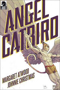
Now Angel Catbird is finally on the stands and, uh, well. Even one of the world’s best writers can’t be great at everything. The plot is standard superhero boilerplate: a scientist named Strig Feleedus is working on a miraculous “super-splicer serum” that will cure diseases by “replacing damaged genes with healthy ones.” Feleedus winds up in an accident that splices his genes with that of a cat and an owl, turning him into a human-bird-cat hybrid. Soon, with the help of a secret society of pun-obsessed half-cats, he’s fighting a human-rat hybrid who wants to take over the world or something.
This is not to say that Angel Catbird doesn’t have its moments. A few of the best jokes in the book demonstrate Murakami-level blending of non sequiturs with a painfully dry delivery. (To transform from his catbird form back to human, Feleedus thinks of a washing machine, because “you ever met a cat who likes washing machines?”) But those amusing moments of self-awareness are rare, and buried under metric tons of awkwardness. The love interest is a half-cat named Cate Leone who is in a band called Pussies in Boots who sings songs with lyrics like this: “You are my dish of cream…you are my catnip dream…you are my midnight scream, it’s true.”
In fact, most of Angel Catbird’s troubles are inside the word balloons. The dialogue is wooden and borderline moronic. On the very first page, Feleedus offers a wall of exposition to his housecat:
Don’t want your buddy to be late for his new job! Seeing as I was head-hunted and all—for a top secret project! Very important! I know you don’t like it, but someone’s gotta pay for the cat food!
It’s so clunky and dumb and arrhythmic that it almost feels like an aesthetic attempt toward purposeful artificiality, like the on-the-nose dialogue in a Hal Hartley film. But there’s nothing under the surface to discover, no deeper meaning to the stilted dialogue. It’s just…really bad comics dialogue.
Here’s the villain after he causes the accident that will eventually lead to Angel Catbird’s creation: “Exit Feleedus! My digitally controlled rat slave was the perfect lure! I’ve destroyed the only sample! Tomorrow I’ll grab the formula off his computer! And enter the age of the rat!” So many exclamation points! It's hard to believe an editor allowed this to happen! If the book was even edited at all!
For a few pages, I tricked myself into thinking that perhaps Atwood was writing Angel Catbird for young audiences; the bad dialogue wouldn’t be excusable if that were the case—kids deserve good writing, too—but it would at least be understandable in the context of a clueless adult talking down to kids. But there are too many sex jokes in Angel Catbird for the book to be intended for very young audiences; in the end, I have no idea who this book is supposed to be for, aside from indiscriminate Atwood fans.
At times, and if you look at it from a certain angle, you can see a sort of cheeky old-school comics aura around Angel Catbird. Atwood occasionally sprinkles trivia about cat and songbird wellness throughout the book, which brings to mind the science trivia that used to appear in silver age Flash comics as “Flash Facts.” But if that is, in fact, Atwood’s goal then she’s embracing the wrong traits of old comics — the atrocious dialogue and thought balloons, the facile motivations — and ignoring the vitality that made those books so compelling. In a year that’s seen some excellent mainstream writers successfully make the leap to the world of comics (Ta-Nehisi Coates, William Gibson) Atwood’s first venture into comics is a fairly spectacular failure.
Thursday Comics Hangover: The Bedrock of our society
You guys, I kind of hate myself for even writing this, but the new Flintstones comic book?
It's pretty good.
I know, I know. I've complained at length about the way publishers have dredged up licensed properties for children and turned them into grim fantasias for psychically injured man-babies. But this is not that. This is something else again.
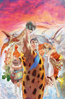
All the new Flintstones comic does, is it takes the premise seriously. Within reason, mind you: author Mark Russell and artist Steve Pugh understand that the idea of a couch made out of a giant prehistoric otter is impossible to take seriously. But they're trying to build a coinvincing mythology around the city of Bedrock: Fred and Barney are veterans of a war to create civilization (they attend a veterans' group where everyone shares stories of atrocities they committed) and everyone worships a god called Morp.
And yes, the book is full of caveman puns (a bar called Homo Erectus, a restaurant called Wammoth Bammoth, Thank You Mammoth) and bad caveman technology jokes (a turtle waiter is a terrible idea.) But there's some sharp comedy, too: Fred's boss is trying to exploit cheap Neanderthal labor, and there's a suggestion of a larger story about the military-industrial complex and the way it keeps the masses in line.
The Flintstones comic is remarkable in the way it ties familiar sitcom tropes together with modern social issues. It's more sharply satirical than the Simpsons has been in decades, and it feels like a premise that could continue for a good long while, though I have no idea who the intended audience for this thing is. (But as an aside, I love artist Steve Pugh — his facial expressions and eye for detail are a large part of why the book is such a treasure — but I have no idea why he's chosen to give all the characters hyper-muscular superhero bodies. Everyone, even Fred's boss, the doughy corporate jackass known as Mr. Slate, is built like an Adonis or a Venus, and it's kind of distracting.)
Part of the Flintstones allure is that it's a comic aimed at an adult sensibility that doesn't ignore important parts of everyday life like family, or love, or friendship. It respects its characters and aims its comedy at targets that feel broad enough to be recognizeable, but specific enough to feel important. It's incredibly weird that this comic book works as well as it does, but we live in an incredibly weird world.
Thursday Comics Hangover: Cruising for nerds
Above all else, most superhero comics should aim to be entertaining. Sure, it’s nice if you get some commentary in there, or a little bit of a political message, but superheroes aren’t the ideal messengers for heavy themes. (Sorry, people who think The Dark Knight Returns counts as deep political satire.) By the entertainment-per-page ratio, Portland author Chelsea Cain’s run on the Mockingbird series for Marvel is leading the superhero pack these days.
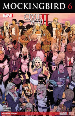
This issue of Mockingbird ostensibly ties in to Marvel’s grating and graceless summer crossover, Civil War 2, but all you really need to know going in is that Mockingbird’s ex-husband, Hawkeye, is on trial for the murder of the Hulk, and the cruise is hosting a large contingent of Hawkeye fanatics. Any woman who has found herself in close quarters with hundreds of nerds dressed up like her ex-husband will be able to relate to this truly universal situation.
Penciller Kate Niemczyk and inker Sean Parsons are intensely interested in making every single background character their own human being, which makes scenes at a Dungeons & Dragons tournament especially fun to read. The lettering, however, is pretty ugly: extra-dialogue elements like a crowd’s chanting and spy-to-English translations are represented in multiple ugly fonts that float on the page, unmoored to the rest of the comic in an annoying way. Some pages look like someone used the “Draw On” tool in MacPaint to slap a few elements on top of otherwise professional work.
The rest of Mockingbird is geared toward maximum reader entertainment, with jokes and clever asides and misdirections. But toward the beginning of the book, as Mockingbird boards the ship surrounded by nerds greeting each other with Vulcan salutes, the observes that she’s alone in a crowd: “If I had hoped to get away from my ex-husband’s troubles, I had come to the wrong place. The good news was, I didn’t need the disguise. Hawkweye fans? They like to pretend I don’t exist.” It’s a clever commentary on the fact that superhero comics fans tend to marginalize and ostracize women characters (and the fans who dress up like them) from their culture. Maybe there’s more to these superhero comics than just entertainment, after all.
Thursday Comics Hangover: Money is power
Midway through the first issue of The Black Monday Murders, a master of finance lectures a class full of eager young geniuses who are about to enter the stock market. He asks them, “you want real advice? Here it is. The first million dollars you make is self-financed. You earn it with your blood. The cost is your health, your family, your friends. You pay, understand?” It’s not quite as splashy as Gordon Gekko’s “greed is good” monologue from Wall Street, but it’s a speech that resonates with the same kind of honesty.
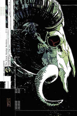
Written by Jonathan Hickman and illustrated by Tomm Coker, Monday is high on its own high concept: what if the top one percent of the top one percent — the wealthiest American families — understood that economics is a black magic? What if a secret society of literal financial wizards were in charge of controlling the entire world’s wealth? What if the power money holds proved to be more than just psychological?
Monday is an impressive package of a book: at five dollars, it’s packed with lots of story pages and also pages full of text and Hickman’s signature graphic design flourishes — some character dossiers, a family tree, an intriguing twist on Snopes.com, a few typographic larks. It’s a deep, immersive dive into a world that Hickman has undoubtedly outlined down to the finest detail. (Hickman has proven to be a meticulous planner; almost all of his Marvel Comics work—hundreds of comics, issued monthly over the course of years—can be read as one single story with a beginning, middle, and end.) We learn about the Caina Investment Bank, the shadowy cabal formed in the wake of the stock market collapse of 1929, and we meet Detective Theo Dumas, an unconventional police officer who is called in to investigate a bizarre murder scene in New York’s financial district.
Coker’s art is exactly right for a book like this: it’s reminiscent of the photorealism of Alex Maleev without the smoky obfuscation. Coker is a stickler for detail: the corkboard in Dumas’s office is laid out with all kinds of tantalizing hints and details that will no doubt play out in issues ahead. The elaborate murder scene in the climax of the book is portrayed unflinchingly without feeling exploitative, and the facial expressions, if a bit stolid, are clear and easy to understand. Colorist Michael Garland gives each scene its own palette, from the slightly sick fluorescent lights of a classroom to the warm, burnished wood of a multi-billionaire’s apartment.
It’s easy to be swept up in the promise of a first issue, before the story plays out and the possibilities start closing up, one after another. But Monday left me feeling hopeful for the future of the story in a way that most first issues do not: the confidence and the depth on display in this issue make it one of the most promising debuts I've read this year.
By attacking the idea of economics as a dark art with its own set of rules, Hickman opens up a world of metaphors that, to my knowledge, has never fully been explored before in comics. He could make high-level economic concepts understandable to a general audience through artful allegory familiar to almost every reader of American comic books. If any writer can successfully translate the dynamics of modern economics to popular culture via a mystery/fantasy mashup, it’s Hickman.
Thursday Comics Hangover: Make Captain Marvel Great Again
On his 45th birthday, Chris is on the cusp of a few different disasters, each one more mundane than the last. His mother died, so he’s moved in with his ailing father. His body seems to be falling apart all at once. He’s been the music editor at a starving alternative weekly (the latest issue is just 28 pages, which in alt-weekly terms is basically a death sentence) for at least two decades, so his employability is questionable at best. But he’s out for a celebratory beer with friends, and he feels grateful for his schlubby nondescript white-guy life. It could be the beginning of a Stephen King story, or an off-brand Springsteen ballad.
On his way back from the bathroom, a young woman grabs Chris’s arm and starts yelling at him. With accusing body language, she snaps: “Why be old when you can be young?...Why be human when you can be more? Stop wasting time. You have the power.” The is fraught with a deeper social meaning: a young woman who appears to be African-American telling a white guy he has the power is a kind of on-the-nose moment.
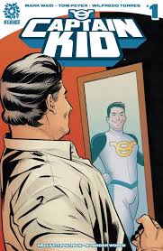
If I didn’t know any better, I’d say that Captain Kid presents a play on Donald Trump’s campaign promises to return America to the days when it was “Great” (the subtext, of course, is white, and male.) Much hay has been made of Trump’s messaging being directed at older white men, who feel disempowered by the diversity and city-centric focus of President Obama’s America. Of course, Captain Kid was likely in the works long before Trump’s rise, but the comic still feels very of-its-moment.
Writers Mark Waid and Tom Peyer have been playing clever games with superheroes for decades now. (Waid most recently launched a very successful Black Widow series at Marvel with artist Chris Samnee.) Captain Kid has one foot planted firmly in postmodernism, but the other is in traditional superhero storytelling, with a plot revolving around a mysterious man who runs a potentially shady lawn and garden company. You won’t find the rawness of Marvelman here, or the grit of some of the more unfortunate Captain Marvel reimaginings of the last decade. They seem to like their main character, even as they challenge his own ideas about what he is.
And the art by Wilfredo Torres resembles the clean lines of Chris Sprouse, paired with the dynamic facial expressions of Samnee. This is good stuff — much better than some of the overwrought artists on mainstream superhero titles. It all combines into a slick, enjoyable package, the kind of book you wish mainstream superhero publishers were putting out.
Captain Kid packs in more than enough clever inversions of traditional superhero ideas to capture my interest, and if the book continues to pick at the political and racial ramifications of its premise, it will very likely become a monthly must-read. Waid, Peyer, and Torres are stomping on some hallowed ground here. They have the potential to create real mischief in future issues.
Thursday Comics Hangover: Jeff Bezos, destroyer of worlds
Seattle cartoonist Tom Van Deusen’s six-page strip “Bezos” opens with Amazon founder Jeff Bezos pouring himself a coffee in a nice-but-not-extravagant kitchen. He talks to his cylindrical Amazon Echo device in the corner. “Good morning, Alexa,” he says. “Good morning, Jeff Bezos,” Alexa replies.
Bezos takes a sip of coffee. He stares at his e-reader. Then he exclaims: “I love reading on my Amazon Kindle! Why would anyone want to read a book? All those pages — BLECH!” He turns back to the black cylinder on his kitchen counter: “Alexa, did I ever tell you that I hate books?”
“Yes, Jeff Bezos,” the Echo replies.
The strip goes on from there, opening as a parody of Amazon-style consumer technology but then spinning into outright farce as Bezos goes on a rampage around town. Van Deusen packs a lot of stuff into six pages, and I’d hate to spoil it all. But without giving too much away, I want to tell you that — and in a year that saw the end of Intruder, this is really saying something — this is one of the most important Seattle comics to be published in 2016.
In these six pages, Van Deusen renders the creator of Amazon as a pathetic figure, an egomaniac, a narcissist, a loser, a needy creep, a conqueror, and a sad sack. His Bezos is a prism depicting nearly every single popular belief Seattleites hold about the man, an inconsistent enigma who barely seems aware of the disastrous consequences of his actions because he can barely hold his own fragile identity together.
“Bezos” is sarcastic, furious, funny, and more than a little bit mean. It doesn’t feel like a goofy comic strip about a popular figure. It feels, somehow, like journalism. Somewhere in this spray of black-and-white panels about giant robots and the horror of modern interior design, Van Deusen managed to squeeze in the entirety of Seattle’s current dilemma.
Thursday Comics Hangover: The Super-Man of Shanghai
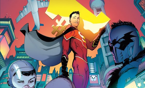
The thing about writing a Superman story, I remarked a few months ago after watching the dreadful Batman V Superman movie, is that the conflict should be based in exploring the concept of morality. All the superheroic trappings — the laser eyes, the flight, the strength — are basically just window-dressing. This is why Superman is a character who easily splinters into many different personalities: when the character famously died in the 1990s, he “returned” as four distinct characters, each with their own variation on the Superman theme, and each with their own spin on what it means to be a moral person.
The new DC Comics title New Super-Man is yet another variation on Superman, and it’s one of the best I’ve seen in quite some time. It doesn’t demand that you understand the internecine continuity of modern DC Comics, or really much of anything beyond the rudimentary idea of Superman. And the idea behind the series is deceptively simple: it takes the concept of Superman and transplants it to modern-day China.
Written by cartoonist Gene Luen Yang and penciled by Viktor Bogdanovic, New Super-Man is narrated by Kong Kenan, a young Chinese man. When we first meet him, Kenan is bullying a nerdy classmate and stealing his lunch. Through a coincidence that is probably more than a coincidence, Kenan is mistakenly labeled a hero. We meet his supporting cast including a nosy reporter named Laney Lan; Kenan’s father, a writer who is preparing to reveal a “secret government agency doing…evil stuff”; and a mysterious woman named Dr. Omen. One of the characters alludes to a slightly modified version of Superman’s credo — Truth, Justice, and rather than the American way, just plain old Democracy — and Kenan gets Superman’s powers.
So far as origin stories go, New Super-Man is not breaking new ground, but Yang manages to convey a lot of information in a small amount of space. This is obviously a book that is set in China, but it’s not over-the-top; no landmarks like the Great Wall of China are cartoonishly alluded to and nobody discusses their relationship with the United States. We’re told by a caption that all the dialogue we’re reading is translated from the Mandarin, with the exception of words printed in blue, which are spoken in English. It’s a full-immersion technique, and it works. This isn’t a book that could be set in Poughkeepsie. It’s very much of its time and place.
Bogdanovic’s art is more than a little stealthy: using some straightforward visual vocabulary like superhero anatomy and sci-fi elements, he relaxes readers who expect something traditional, but he sneaks in some extra exaggerations here and there — a ridiculously large gaping mouth, say, or some heavy shadow on a brooding Kenan’s face — to introduce a looser, more cartoony feel. The Shanghai in these pages might as well be a science-fiction city, the way Bogdanovic draws it, with its high-spire Jetsons architecture and the bright orange and turquoise palette provided by colorist Hi-Fi.
Because New Super-Man is so, uh, new, it’s hard to say exactly where Yang is going with all this. Will this be a political book? Is it a commentary on superheroes, or a relatively straightforward tribute to earnest heroics, like G. Willow Wilson’s Ms. Marvel? It really could go anywhere from here, which is exciting. The one theme that is absolutely clear from this first issue is that Yang is going to be using the character of Kenan to explore morality, both as a universal concept and what it means for the individual. In other words, it’s already apparent that it’s a very good Superman comic.
Thursday Comics Hangover: The third Panther
It's been three months since the first issue of the Ta-Nehisi Coates/Brian Stelfreeze Black Panther was published. You can tell that the series has become a runaway bestseller because it's the first monthly comic that local bookstores like University Book Store and Elliott Bay Book Company are carrying as they're released, rather than waiting for the hardcover graphic novel compilations to be published.
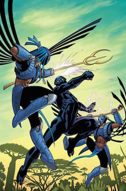
The most interesting characters in this series, though, are Aneka and Ayo, the lovers who have vowed revenge on the Panther as the Midnight Angels. They've demonstrated the most emotional range of all the characters, and they seem to have devised a complex plan to take down the Black Panther. It's quite possible that Coates is more interested in them than he is in the book's supposed protagonist, which is perfectly fine. The Panther's magisterial longing for peace and acceptance is better off in the background of his own book. The supervillains, after all, often steal the show right out from under the hero because they're allowed to want more interesting goals.
Unfortunately, the monthly schedule seems to be grinding down Stelfreeze's art. The striking layouts and refreshing chiaroscuro of the earlier issues is slowly disappearing, replaced by a much more standard superhero comics illustration. (I had to check the credits page while reading the issue because I wasn't even sure Stelfreeze drew the comic.) Only occasional scenes, such as a sequence set in a Wakandan afterlife, demonstrate the kind of verve that he brought to every page in the debut issue.
The thing about monthly comics is that they're a long haul. If a creative team cannot sustain its energy all the way through a story, the story suffers. You can't take back a book's chapter once it's already been published. For now, Coates is still demonstrating the same intellectual excitement for the material that he did in issue number one. The question is whether Stelfreeze will be able to join him across the finish line.
Thursday Comics Hangover: Outside the prison walls
It’s probably just a coincidence that the eighth issue of Kelly Sue DeConnick and Valentine De Landro’s sci-fi women-in-space-prison comic Bitch Planet was published less than a week after the fourth season of Orange Is the New Black arrived on Netflix. But, for the sake of people who write weekly columns about comic books, it’s a happy coincidence. From the very beginning, Bitch Planet has been compared with Orange, and it’s easy to see why: they’re both about womens’ prisons, they both feature diverse casts, and they’re both feminist-minded sociological studies of modern incarceration culture.
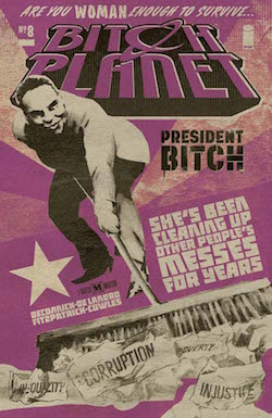
Anyway, the eighth issue of Bitch Planet is easily the best issue yet. The series has always been entertaining and confident — that first issue was easily one of the best series debuts of the last decade — but issue #8 hums with a special kind of power. It’s hitting that sweet collaborative spot where a writer and an artist sync together into a team that is greater than its parts.
De Landro is using more complex panel layouts in the service of more nuanced storytelling. An early scene in which a transgender woman (sentenced, an information box informs us, for “gender falsification, deceit”) undergoes a medical exam works as a microcosm of the series so far: in four pages we see dignity in the face of institutional demoralization, rebellion, pride, anger, and kindness. Another sequence in the middle of the book is heartbreaking and creepy, using a sci-fi backdrop to magnify a parents’ grief. It’s the most memorable image in an issue packed with memorable images.
(A quick aside: If you’re waiting to buy Bitch Planet in collected trade paperbacks, you’re missing out on something great: the back issue of every issue is packed with pages of interviews, columns, fan letters, and essays that expand on the themes of the issue. It’s like getting the modern version of a 90s riot grrrl zine for free with every issue of the comic.)
It’s hard to say where Bitch Planet will end up. This latest issue brings some political intrigue that suggests the story may be about to burst out of the confines of the prison. That would be just fine with me; Deconnick has made it abundantly clear in previous issues of this series that prisons aren’t the only way women are kept captive. Here’s hoping we’ll see a lot of breakouts before the series is through.
Thursday Comics Hangover: Glaciers move faster than this comic book
In 2010 and early 2011, writer Brian Michael Bendis and his frequent collaborator, artist Alex Maleev, published the first five issues of a comic titled Scarlet. Bendis and Maleev have always been ideal collaborators: something about Bendis’s propensity for including too much Mamet-style dialogue on every page works well with Maleev’s photorealism, which often fails to convey action in any convincing way. Their comics — particularly their long run on Daredevil — tend to be wordy dramas that feel more like plays than the usual action movies you’ll find in superhero comics. They're better together than they are apart.
Scarlet is built on an intriguing premise. Set in Portland, the comic stars a woman named Scarlet Rue who targets the corrupt Portland Police Department in the hopes of starting a revolution. Scarlet frequently breaks the fourth wall to talk to the readers of the comic, and early in the series she promises to use the readers as a part of her plan, somehow. The book read like a cross between Fight Club, Occupy Wall Street, and a childrens’ TV show, and those first five issues were fairly vibrant examples of what Bendis could do when he focused his attention on expanding the medium in interesting ways.
Then nothing happened for two years.
In 2013, Maleev and Bendis published the next two issues of Scarlet.
Then nothing happened for three years.
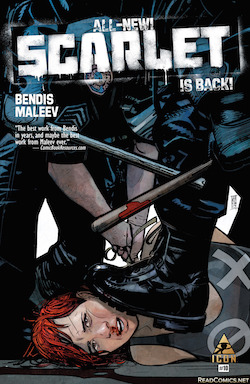
Last month, Bendis and Maleev published the eighth issue of Scarlet, which was immediately followed by the ninth issue of Scarlet. Yesterday, they published the 10th issue. This wraps up the second story arc of the series, which will be collected soon as Scarlet, Book 2. This flurry of publishing came with the news that Scarlet was in development as a TV series for Cinemax. (Generously assuming one episode per published issue of the comic, it’s highly likely that the series will be very loosely based on the book, given that they’ll have to come up with their own stories in less than a single seasons’ worth of shows.)
The 10th issue of Scarlet kicks off with one of the best sequences in the book, a personal account of sexism within the Portland PD that opens up the interior life of a supporting character. The passage is illustrated in a sketchy, almost childlike, style unlike anything else Maleev has done, and it adds to the tremendous sense of stylistic potential that Scarlet has carried with it since the very beginning.
Unfortunately, the story then reverts to form, with Scarlet playing crowds of angry people against the Portland Police Department again — I’ve honestly lost count of how many times variations on this scene have played out, because I haven’t re-read the series in the six years it’s taken these ten issues to be published. And then on the last page of the issue come the words that will make all but the most cynical of readers throw up their hands in defeat: “TO BE CONTINUED…NEXT YEAR.”
Okay. It’s clear that Scarlet is not a money-maker of a series. (In addition to Scarlet, Bendis is also writing two Iron Man series — one of which is illustrated by Maleev — a Spider-Man series, a Guardian of the Galaxy series, and Marvel Comics’ big summer crossover event, Civil War II.) But this publishing schedule is ridiculous. There’s no point in publishing a story in individual issues like this if a reader could earn a graduate degree in the amount of time it takes for two full chapters to dribble out in ten comics. If the book is a labor of love for the two creators, why not just publish Scarlet in collected form? As it is, Maleev and Bendis are just frustrating the few loyal fans they have left with this erratic publication schedule and squandering the considerable good will they built with those striking first issues.
Thursday Comics Hangover: The Vision keeps getting better
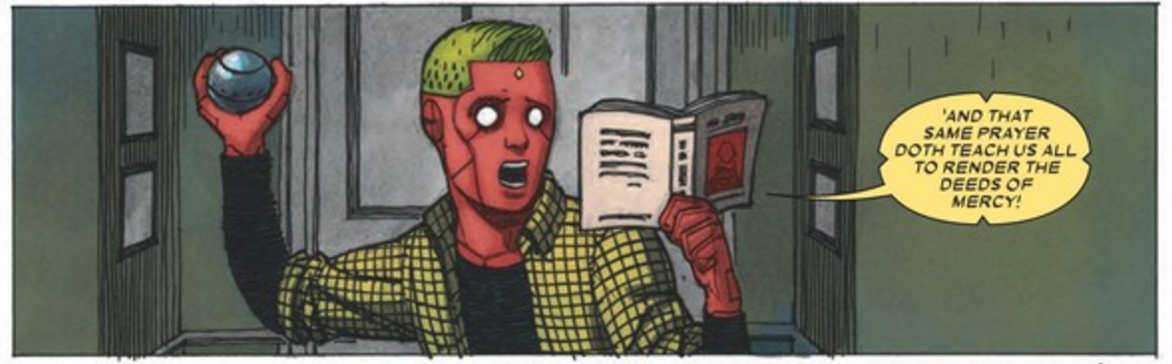
Writer Tom King’s The Vision series from Marvel Comics is such a weird, wonderful thing. It’s a superhero comic that features virtually no superheroics, a domestic drama about superheroes that’s more interested in the psychology of its main characters than their powers. It’s a Cheeveresque suburban drama where the secrets that the main characters keep from each other manifest in the form of murder and the deeper issues of faith and existential angst materialize in the form of the convoluted Gordian knot of comics history.
The eighth issue of The Vision pushes along the plot of the series, after a seventh issue that reveled in the characters' deep and occasionally contradictory history. The synthezoid superhero and his family have settled into an uneasy tranquility, and they’re enjoying a visit from their “uncle,” a superhero created by the power-mad evil robot Ultron. Things seem positively cheery for a while, until, of course, they stop seeming cheery. Artist Gabriel Hernandez Walta portrays all the characters with a wide-eyed innocence, and he underplays the science fiction elements beautifully. He puts such attention into the detail of Vision’s family’s somewhat preppy clothing that you almost forget their skin is a radioactive pink-purple.
The best parts of the issue are the scenes that don’t necessarily have to do with advancing the plot. The Vision’s son reads the trial scene from The Merchant of Venice — the passage about justice and salvation not being the same thing — as he absentmindedly plays fetch with his robot dog, Sparky. Meanwhile, Vision’s malfunctioning wife is plunking away at a piano and slowly falling apart. Her housewife’s lament touches on the core themes of the series, the question of reality and synthetics, of tools and humanity:
When when I simply access the notes and play play play them well...I seem to feel that I am not playing them. I have… simply…become the piano. I am perfect perfect perfect I am the piano. I am I am I am.
There are very few comics that compare to The Vision. It’s a dense and literate story that celebrates its pulpy superhero roots. It’s not a deconstruction, the way Watchmen was. It’s not one of the hyper-serious re-imaginings we’ve seen time and again in Watchmen’s wake. It’s not a winking postmodern joke. It’s a book that has its own rhythms and its own uncomfortable vibrations. It’s heartbreaking to think that King is leaving The Vision with issue 12. He claims that his story will be complete with that last issue, but it’s easy to imagine 50 or 60 more issues of this, collected into something dense and weird and creepy: the great American superhero novel.
Thursday Comics Hangover: Coming back to Captain America
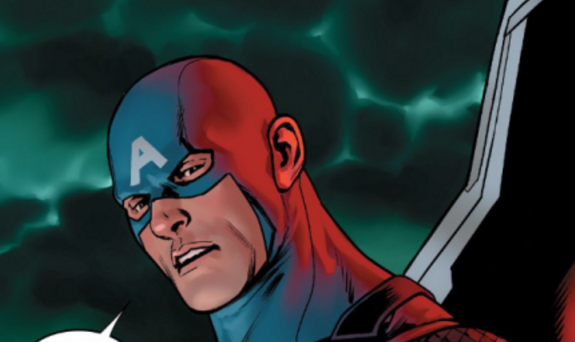
Last week, Marvel Comics published the first issue of a comic book titled Captain America: Steve Rogers by writer Nick Spencer and artist Jesus Saiz. At the end of the comic — uh, spoilers, I guess — the superhero Captain America is revealed to have always been a double-agent of Hydra, a super-villain analog to the Nazis. (You can read an explainer here.) People on the internet wrote a lot of posts and tweets and Facebook updates expressing their dismay about the reveal. Also last week, I wrote a flippant post on this site telling people not to get upset about it, that it was just a comic book and that there was no point in being outraged.
In retrospect, I shouldn’t have written that post, because it was a bad post. It was flip and unthoughtful, which are two qualities I dislike when they appear in my writing. What I was doing there was applying my own experience — both as a lifelong superhero comics fan who has become jaded about plot twists, and as a white guy — to a situation without any consideration of what someone else’s experience might be. A couple of our readers alerted me to some writing which helped me realize that I was being boorish and insensitive to these other experiences. I particularly learned from a post by Megan Purdy at Women Write About Comics and a pair of posts on the Tumblr Tea Berry-Blue.
Another post that helped me realize I was being a jackass was Devin Faraci’s rant on Birth.Movies.Death about so-called “fan entitlement.” Faraci’s post reeked of establishmentarianism; he was defending the poor, put-upon corporate entertainment from the mean old fans in a way that instantly made me realize how dumb I had been. I reject Faraci’s claims that “fandom is broken.” I dislike the idea that there are good fans and bad fans, or that you need a certain level of understanding to truly enjoy a piece of entertainment. By railing against the responses to a piece of art, you are actually taking a stand against cultural criticism. And I am all for cultural criticism in all its forms; it’s why I co-founded this site. (That said, some basic points about fan responses must be made: death threats are absolutely never okay, and burning a book to protest a character’s Nazism is unbelievably stupid.)
Recognizing my worst traits in others is a theme in my life right now. As a straight white guy of a certain age — I turned 40 last week — I’m very sensitive to the predictable ways in which my generation is becoming terrible. People I went to high school with are now writing outraged Facebook posts complaining about PC culture, vocal fry, and coddled millennials, and it makes my fucking skin crawl. I do not want to be one of those people who reflexively assumes that The Kids Are Up to No Good simply because I’m not one of the kids anymore. I do not believe that my youth was the Good Old Days, or any kind of a golden age. That is a cheap and easy worldview. It’s lazy and self-affirming, and it’s anti-empathy.
As a writer, my deal should always be that even if I don’t agree with you, I should always make an effort to at least understand where you’re coming from. I did not do that in my post last week. That was a mistake, and I regret it. And I certainly am in no place to pass judgement on people who regard this story (and Marvel's promotion of the story) as anti-Semitic or cavalier about the perception that it might be anti-Semitic. My insensitivity on that last point, in particular, is especially egregious; it's not my place to dictate to any other group how they respond to art.
That said, as a book critic — and as someone who reviews comics in this space every Thursday — I do have some thoughts on the story that might be relevant. Reviewing ongoing comics is a tricky business, because you’re basically reviewing a book one chapter at a time. And it’s perfectly within your right to abandon a book because something in the first chapter offends you. But here’s why I think this storyline might be worth reinvestigation later on down the line: Between this Captain America comic and its sister title, Captain America: Sam Wilson, Nick Spencer is writing a comic series that is very much centered around the America of today. His comics are very overtly responding to the racist insanity of the Republican presidential primaries and the unhinged anti-immigrant sentiment on the right and the rise of Donald Trump.
Captain America has, through the years, always embodied America’s self-regard: in the Watergate era he abandoned the name of Captain America; during the amoral, business-friendly Reagan Administration he was forced out of his job due to a copyright dispute that eventually led to a murderous maniac taking on the Captain America title; the steroidal Bush/Clinton years saw Captain America becoming a tool of excess, wearing gaudy armor and having ridiculous adventures; the shameful conclusion of the George W. Bush presidency saw Captain America bound in chains and assassinated. Is it too much to consider that perhaps in a time when the Republican presidential candidate is a buffoonish reality TV candidate preaching fascism to packed stadiums of howling, fearful Americans that a story about the moral corruption of Captain America might be worth telling right now?
When Spencer finishes telling his story, it might be worth reinvestigating to see how successful he was. But if the ham-handed way Marvel Comics handled the publicity for the story made a reinvestigation impossible for you, that’s totally understandable. If you dislike or are offended by the premise so much that you simply can’t stomach the book, that’s okay, too. You can respond to the story however you choose — you can write about it, boycott it, tweet your opinions. It doesn’t make you a bad fan, or a symptom of a broken fandom. It means that you care, and that you’re responding to your culture as a fully empowered human being. It is your right, and that right is something to be celebrated.
Thursday Comics Hangover: William Gibson comes to comics
All the cool literary people are writing comics now. Ta-Nehisi Coates is doing an excellent job with Black Panther, Margaret Atwood’s comic Angel Catbird is coming out sometime this year, and yesterday the very first issue of sci-fi legend William Gibson’s very first comic, Archangel, hit the stands. Co-created with screenwriter Michael St. John Smith and illustrated by comics veteran Butch Guice, Archangel is closer to Gibson's previously published work than, say, Black Panther is to Between the World and Me, but Gibson is definitely marking new territory here; this is not a lazy cash-grab Neuromancer sequel in comic form or anything so crass.

The first issue of Archangel introduces several complicated concepts with ease: time travel, UFOs, espionage, and international relations during the second World War. In the first five pages, it also evokes that classic time-travel cliché of murdering your own grandfather, just to let you know that Gibson is aware of the tropes of the genre, and to warn you that he’s not messing around.
And neither is the artist. Guice is one of those rare comics professionals whose work is noticeably improving as he ages. The stiff realism of his work in the late 1980s/early 1990s has loosened into something a little simpler. He still pays close attention to the fashions and surroudings of his characters, but the looseness of his work allows the faces on the page to show more unforced emotion. His characters aren’t posing anymore, as they were in the days when Guice worked for Marvel Comics, they’re emoting and moving and interacting. (Some of the credit for this evolution must go to inker Tom Palmer, of course, and Palmer definitely provides some of the Bryan Hitch-like confidence in the finished art. But a few pages of reproduced un-inked pencils in the back of the book prove that Guice’s art is consciously evolving.) He’s packing as many as ten panels on some pages, but the layouts feel unforced and cinematic.
Gibson does have some lessons to learn about writing for comics. Though he trusts Guice to relay information visually, some of the pages are a little too verbose, with word balloons unbalancing and obscuring the art. Writing for comics, particularly in dialogue, has been described by Seattle author G. Willow Wilson as haiku and by Coates as poetry; Gibson occasionally falls back into prose in some of his dialogue. He doesn't desroy any single page with expositional walls of text, but some sequences are remarkably wordy when compared to most modern comics. It would be nice in future issues to see Gibson lean back a bit and allow Guice a few splash pages and widescreen sequences to really show off his genius for creating settings that a reader can practically walk through with her eyes.
These are relatively mild complaints. As a first issue, Archangel is interesting, provocative, and a hell of a lot of fun to read. Gibson is clearly having a good time translating his skill set to a new medium, and it’s thrilling to see him take on a couple subgenres of sci-fi that he’s never written before. Part of the appeal of these polished literary talents approaching the serialized storytelling format is getting to watch them learn the rules of the medium in real time. It’s as close an experience as we’ll ever get to sitting behind Gibson at his writing desk, watching him over his shoulder as he writes his newest novel..