Archives of Thursday Comics Hangover
Thursday Comics Hangover: The circle and the rectangle
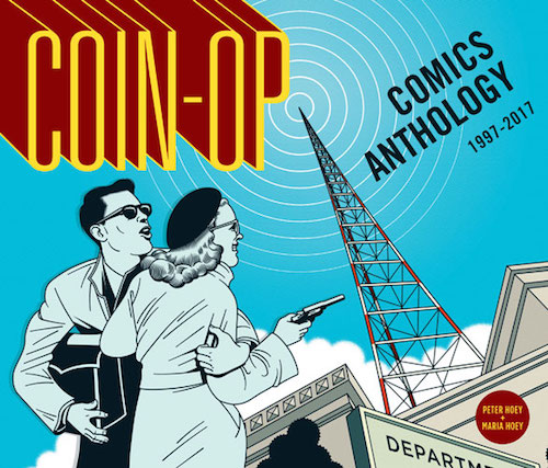
I've written a few times before about my love for the comics magazine Coin-Op, which is written and drawn and colored and designed and everything-else-d by brother-sister cartooning team Peter and Maria Hoey.
You might have had a hard time tracking down an issue of Coin-Op the last few times I wrote about it; the series was only available at a few indie shops or at special occasions attended by the Hoeys, like the Short Run Festival. Now, though, you're out of excuses: you can pick up or order a hefty collection of the Hoey siblings' comics at any bookstore in the country. Published by Top Shelf Productions, Coin-Op Comics Anthology: 1997 - 2017 is a sharp-looking hardcover collection of the first five Coin-Op books, as well as earlier Hoey comics that appeared in places like Blab! Magazine.
Coin-Op comics are fundamentally built out of two distinct shapes. First is the squat rectangle of the page. All the Hoeys' strips are laid out in horizontal format, giving each page a sprawling sense for those who are accustomed to the vertical orientation of most modern comics.
The second, and maybe most important, shape is the circle. (I'm hardly the first person to notice this: "The characteristic icon of Coin-Op is the perfect circle," writes Josh O'Neill in the introduction to the book.)The Hoeys evoke perfectly rendered circles in almost all their work, from a crisp white tabletop to the chaos of a river flooding a nondescript office in overlapping circular panels. Their characters run in circles. In some instances, their heads are perfect circles. The moon hangs in the sky like a shiny quarter. A man examines a diamond ring.
All of the comics in Coin-Op riff on variations of those two shapes: the broad expanse of a rectangle and the unending loops of a circle. A movie screen and a spinning jazz record. The Hoeys are history buffs, drawing strips that riff on Vertigo and the life of the director of Rebel Without a Cause. Other strips discuss the life and legacy of jazz greats like Herbie Hancock and Django Reinhardt.
My favorite part of Coin-Op is when the Hoeys test the limits of comics as a storytelling medium. One strip breaks a parade accident down into a string of interconnected narratives, each given its own progression of individual panels that form part of a greater whole. A wordless strip surveys a crime wave committed by a pigeon. The most surreal strips play out in banal cubicles — beige offices so bland that the reality of the comic strip seems to fold in on itself as an act of rebellion against the boredom of ordinary life.
If, like me, you believe the storytelling range of comics has yet to be fully explored, the Coin-Op anthology is for you. These comics are dancing on the razor's edge between strict formalism and chaotic play. That's where the most interesting stuff always happens.
Thursday Comics Hangover: The hero comics deserves
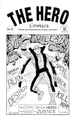
For many years, cartoonist Steve Ditko created and sold comics outside the traditional publishing system. With the assistance of comics editor Robin Snyder, Ditko sold his comics directly to the public through Kickstarter.
I've supported several of these Kickstarted books, and in the list of backers located on the inside back cover you could often find the familiar names of comics creators. The most recent Ditko comic to arrive in my mailbox this spring, The Hero, included cartoonist Stephen Bissette and comics writer Tom DeFalco — and other titles have included famous backers like Neil Gaiman.
I often thought of these books as a kind of community retirement plan for Ditko, who passed away last week at the age of 90. Marvel didn't compensate him nearly what it should have for his work in the creation of Spider-Man and Doctor Strange, and Ditko slowly stopped working for most traditional comics publishers for reasons that he always kept private. He seemed to be in need of assistance, and he was certainly not the kind of person to accept charity. So backing comics like The Hero were a way to thank Ditko for all his work, and to show him that we still loved him.
Most of Ditko's Kickstarted comics were uneven collections of text pages written by Snyder or Ditko or a combination of the two, and short comics written and drawn by Ditko. The comics tended to be collections from Ditko's archives; in The Hero, there's a comic about a hero called Killjoy that was originally illustrated in 1988.
Ditko's Objectivism is on full display in The Hero. In the Killjoy story, some civic leaders at the "Foundation to Protect the Guilty from Justice" are weeping giant tears into puddles on the floor. A wealthy-looking man named Mr. Hart goes on a tremendous, tear-soaked rant that sounds like a conservative's view of what a liberal criminal justice system would sound like:
Wah! It's unjust! Killjoy's ruining the careers of hard working criminals! They have rights! We have to help them...raise bail...hire lawyers...demand crime be made legitimate!...Wah! It's cruel! When criminals can't practise their profession! Their victims never cooperate and now this Killjoy! It's too much for decent men to take! Sob! Criminals are as law-biding as non-criminals.
Then the Foundation goes no a protest march, with signs reading: "Our first concern is for the guilty," "We need a union for hard working criminals," "For every guilty victim, there is an innocent criminal."
Of course Mr. Hart is mugged by criminals and he makes excuses for them even as they smash the teeth out his face. And of course Killjoy crushes the criminal syndicate (which includes a man dressed like Robin Hood, a coal miner, a gorilla, a lion wearing a domino mask, and a python.) It's exactly as philosophically simple-minded as you'd expect a comic from one of Ayn Rand's most devoted acolytes to be.
But there's a lot of fun, too, including a short comic about a hero called Mr. Quiver, a big-bellied bald man who eats Jello and defeats the bad guys by absorbing their punches and jiggling them back at them. Originally drawn in 1985, the strip seems like an early pass at Speedball, the bouncing boy superhero Ditko would create for Marvel a few years later.
But the title story in The Hero is the true gem. Drawn in 2009, it's Ditko's superhero work reduced to its purest form. It begins with a splash page of a man in a garish wavy-lined costume with a giant "V" on his chest. He carries a large club, and he announces, "I'm the Villain! Initiation of force, might, is good, right, just! No one dares oppose me!"
Of course, then a man in a suit with a giant "H" emblazoned on it shows up. The Villain identifies this man as "The Hero," but The Hero doesn't talk in the course of the story. He just laughs: "HA HA HA HA." Meanwhile, in the background, a large group of people — presumably the general public — mocks The Hero and praises The Villain.
The Villain and The Hero get in a fistfight for a couple of silent pages, and then The Hero knocks The Villain out cold, smacking him into a pile of garbage and rats. Triumphant, The Hero then seems to, as best I can tell, juggle a bunch of cylindrical cacti wearing cowboy hats in the final panel while the general public grumbles that the fight was rigged.
The art in this comic is beyond loose, but it it distinctly Ditko. It feels like every line has to be there, that Ditko willed it to be. On a pure black and white page, his certainty is a beautiful thing to behold.
Thursday Comics Hangover: The quiz kid raises a family
Michael Kupperman has for years been producing very funny comics for outlets including the New Yorker and McSweeney's. His work has been published in books from Fantagraphics and HarperCollins. But just when you think you've got the cartoonist figured out, he sweeps your legs out from under you: Kupperman's new memoir about his relationship with his father, All the Answers, is something special.
Decades before Michael was born, Joel Kupperman was an early television star, a quiz show celebrity whose talent — the ability to quickly and accurately perform complex math in his head — made him a beloved figure. Like most early fame, Joel's celebrity washed away. And as an adult, he refused to discuss his years as a quiz kid.
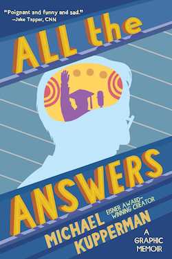
Kupperman takes great care to redefine his comics vocabulary in All the Answers. The art is very obviously still his, but the rhythm of the book is different — slower, simpler, more accessible. That's not to say that he's slumming at all: though Kupperman often only relies on two panels per page here, the relationships between those panels can be very complex.
A portrait of Henry Ford, for example, stares out at the readers from in front of a busy background that resembles TV static. The "camera" pulls back further to reveal that Ford is a portrait on a wall. The wallpaper is comprised of hundreds of thin, dense lines. Standing in front of the Ford drawing in the second panel is Adolf Hitler. It's an obvious representation of how Ford's anti-Semitism influenced world leaders like Hitler, but those clashing backgrounds also tell a thematic story about chaos and control, about personality and its influences.
Kupperman uses that kind of transition often, particularly when dealing with his relationship with Joel. The perspective in a panel will back up a step or two between panels, to illustrate the distance between Joel and Michael, and the distance between the past and the present.
As Joel ages, he grows more and more bitter about his childhood experiences. Some of that rage eventually seeps into Michael, and All the Answers feels like an attempt to harness that anger, to keep it from infecting a whole new generation.
Kupperman's self-portrait in this book is a fascinating choice: the whorls of his hair are visually appealing, and the clean bold lines of his face have an attractive curve to them. He looks friendly, except for the eyes. Kupperman draws his own eyes as tight little circles that are too small for his face. They don't wink or tense or widen. They could almost be buttons sewn on top of his eyelids, and they give him a kind of impenetrability. It's hard to emote when you don't have access to the range of emotions that a pair of expressive eyes can provide.
I think with those eyes, Kupperman is establishing a distance between himself and the reader — the same way his own father held himself back from being too emotional with his son. This could be off-putting for some readers, who might believe that the point of a memoir is to be as emotionally open as possible.
But really those immobile eyes are essential to the story: if Kupperman were as forthcoming with the reader as other confessional memoir writers, the story wouldn't make sense. Kupperman knows how to keep his audience at bay when he needs to. It creates the same aura of mystery that his father enjoyed for much of his life.
Those looking for closure will likely not enjoy All the Answers. But for everyone else — for all the people who love books about complicated relationships between parents and children, like Fun Home or The Glass Castle, All the Answers is a balm. Though it's drawn in lines so big and clear that it could practically be a coloring book, Kupperman embraces fine details and nuance in his story.
This is the kind of book that will live in your head for years. You might just find, one bleary morning after too many dreams of dead relatives, that you look in the mirror while brushing your teeth only to see Kupperman's inexpressive cartoon eyes staring back at you. Those eyes might not smile or widen, but they can see everything.
Thursday Comics Hangover: The death of Kill or Be Killed
If you just glance at him, Dylan — the main character of Kill or Be Killed — looks like a classic comic protagonist, a brown-haired generic white guy like Peter Parker. But Sean Phillips is a subtle artist, and at certain angles Dylan's presentation falls apart. His bangs just hang limply in his face. His mouth falls open and he stands slack-jawed a lot. His posture is bad.
Ed Brubaker, the writer of Kill or Be Killed, said that the series is intended in part as an homage to 1970s Spider-Man comics, and the cover of issue #20, which was published yesterday, is a direct tribute to one of the most famous Spider-Man covers of all time. But the series isn't about a superhero: Dylan is a spree killer, an unhinged vigilante who, at the behest of a demon who may or may not be real, murders anyone he deems as guilty. We don't know how much of the story is real, or how much we should trust Dylan. In practice, Kill or Be Killed is a closer relation to Taxi Driver than to any Marvel Comic.
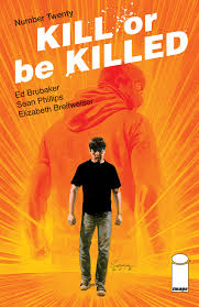
This twentieth issue marks the end of (at least this iteration of) Kill or Be Killed, and the book is definitely worth picking up in a collected edition. This is, far and away, my favorite of Phillps and Brubaker's many collaborations — a riveting cross between Notes from Underground and The Punisher. (Come to think of it, the misanthropic star of Dostoyevsky's novella could just as easily have gone vigilante himself: "I am a sick man. I am a spiteful man. Criminals are a cowardly and superstitious lot.")
Kill or Be Killed arrives at just the right time: fandom has, like the rest of the country, grown unhinged and entitled. They're having a hard time drawing a distinction between themselves and the heroes they admire. Dylan is, in many ways, a reflection of that self-regard: obsessed with a sci-fi/fantasy painting of his father's, Dylan decides he alone is the arbiter of the difference between right and wrong. He loathes all institutions and believes that justice is best delivered with extreme prejudice.
I can't say much about the last issue of Kill or Be Killed without ruining the story, but I can tell you that it is satisfying, in much the same way that the rest of the series is satisfying. It curves around your expectations and furiously resists any easy answers. Just when you think you've gotten your hands around the book, it slithers out of your grasp and starts nipping at your heels again.
Thursday Comics Hangover: Very good, Jeeves
Why isn't Roger Langridge one of the most popular cartoonists in the world? His cartoons are so lushly rendered that they demand repeated inspection, his stories are clear and funny and thoughtful. He can draw both a pratfall and an existential crisis — and even more impressively, he can make the pratfall incredibly sad and the existential crisis laugh-out-loud funny.
Langridge's best work, in my estimation, is Fred the Clown, a lovely little collection of short comic strips about a lonely clown, from Fantagraphics Books. It's full of poetry and music and tears and laughter. Everyone who loves comics should own a copy. And somehow, Langridge is still working in relative obscurity.
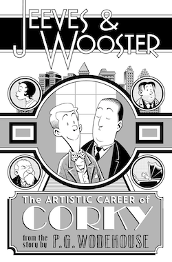
Last week Langridge published an entire comic book for free on his website. Even better, it's an adaptation of a public domain story titled "Leave It to Jeeves" by P.G. Wodehouse. (The original story is available here.)
"I've always wanted to do a P. G. Wodehouse graphic novel adaptation," Langridge writes in the post, "and the only way I know of of making that happen is to actually do a few pages and see whether I can get anyone interested in publishing some more." We should all lament the fact that we live in a universe in which publishers aren't tossing Langridge money to do whatever he wants to do, but we should be grateful, at least, that we get to read new work by Langridge for free.
And it turns out, obviously, that Wodehouse and Langridge are a delightful combination. The Wooster and Jeeves relationship works remarkably well in comics form, and Langridge gets some great comics history references across in a non-obtrusive way. And the reveal of Corky's painting in the story is a hilarious payoff that perfectly demonstrates why this story deserves to be adapted into a visual medium.
Look, I could go on, but the point is simple: Roger Langridge wants to do comics adaptations of Wodehouse novels. Someone needs to make sure this happens, please.
Thursday Comics Hangover: More than Crumbs
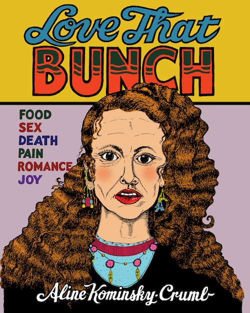
I'll admit, I'm not a huge fan of the jam comics made by the husband-and-wife team of Aline Kominsky-Crumb and Robert Crumb. The ironic cutesiness of those comics is nearly indiscernible from real cutesiness, and the juxtaposition of Crumb's formalist rigor next to Kominsky-Crumb's primitive illustrations is only good for a momentary thrill, and not a continued investigation. For a few years, Drawn Together, the collection of the married couple's collaborations, has been the only work of Kominsky-Crumb's in print.
Thankfully a new reissue of Kominsky-Crumb's solo comics, Love That Bunch, reminds us that she's a cartoonist in her own right, and not simply an extension of her husband's drawing hand. Bunch collects her early work from the 1970s and 80s, and it also includes a long new story, "My Very Own Dream House," that looks back on Kominsky-Crumb's childhood.
The act of simply flipping through Bunch can teach you a lot about Kominsky-Crumb's evolution as an artist. Her early work looks more like traditional comics, with smaller word balloons and more room for the art. But as you scan through the chronological progression, you can see words start to spread throughout the comic, like a mold outbreak on clean white tile. Eventually, Kominsky-Crumb's narration dominates every page, with up to six individual word balloons per panel. The drawings become smaller and smaller, focusing more on figures than backgrounds or settings.
But when you flip to "Dream House" at the end of the book, you can see Kominsky-Crumb's cartoons have come full circle: once again, she's allowing more room for her art to breathe, and she's not bombarding the reader with too much over-explanation. (One of my favorite panels is of Kominsky-Crumb's daughter, Sophia, vomiting while shouting "I HATE YOU, FRANCE!")
Kominsky-Crumb made her name with a kind of brutish honesty that at the time felt revolutionary. Not a lot of women were openly and frankly discussing sex and periods and body image issues when Kominsky-Crumb started out. And the fact that she illustrated these taboo stories with crude illustrations that didn't look traditionally beautiful only angered the establishment even more.
In retrospect, though, those early diary comics aren't really shocking at all. Looking back over four decades at the strips that originally had a kind of punk rock allure, they instead feel a little bit quaint. That's progress for you.
Instead, the strength of Love That Bunch lies not in striking moments but rather in the accrual of many such moments. It's a compelling and comprehensive account of what it was like to be a young woman at a very particular time, and it comes with its own meta-commentary about how Kominsky-Crumb feels about the work after nearly a half-century has passed.
If you asked me when I first read Kominsky-Crumb's comics in the 1980s whether I'd still be thinking about her work in 2018, I would've laughed at you. But these stories have aged well as a very personal document of a very strange moment in American history, while Robert Crumb's work has lost some relevance in my estimation. Who knows? Maybe in fifty years, young people will declare Kominsky-Crumb to be the real comics visionary in the relationship.
Thursday Comics Hangover: Truth, justice, and popping pimples
Supergirl is a great character at her base, but she's been through so many permutations that it's hard for new fans to figure out where to begin with her. In the 1990s, she was a shape-changing interdimensional life form who had an affair with Lex Luthor. In the early 2000s, she was a sexualized fanboy's wet dream. In the 1980s, she was a perky aerobics instructor type who sacrificed herself to save the universe.
You can find a few stories from every period of Supergirl's long career that might appeal to wider audiences, but what about her origin? What about Supergirl is unique? What book explains her place in the universe without using her relationship to Superman as the primary measurement?
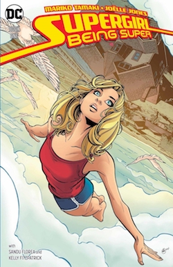
That's where Supergirl: Being Super, a new paperback collection written by Mark Tamaki and illustrated by Joëlle Jones, comes in. Being Super is an origin comic that reimagines Supergirl's story in the framework of a contemporary young adult novel, complete with pimples, high school friendships, and a confident main character who struggles to find her place in the world.
Jones is one of the most gifted superhero artists at work today. Her Supergirl is dynamic and distinctive, a tall and occasionally gawky young woman who carries all her worries and her joys plainly on her face. She looks and carries herself like a high school student, unlike most of the recent incarnations of the character.
Tamaki fills in details to Supergirl's origin that other writers never bothered to consider. Her adopted father is gruff and more than a little controlling, but sweet deep down, like a cross between Ron Swanson and Pa Kent. Her friends are the kinds of good people that a superhero would want in her life: thoughtful and kind and inspirational. Poignant moments, like a kid sister reading a goodbye letter during a high school student's funeral, are moving without being maudlin. It's a fully-developed world, and the plot examines Supergirl as a decent character without making her unbelievable. (This is the best way to handle Super character, as I've written.)
That said, Being Super does fall into a few of the traps that have befallen Superman comics over the last few years. There's way too much time spent on Kryptonian culture and history, for one thing. Nobody cares about Krypton; Krypton is useful only as the reason for Superman and Supergirl's powers, and the less you dwell on it the better. And the plot is stretched a little too thin in the first two thirds of the book and jumbled up a little too thick in the last third.
But this is the best origin that Supergirl has ever gotten, and I hope Tamaki and Jones get to revisit this world sometime soon. Readers deserve a solid run on the character to consider as canon, and Being Super makes for a great start.
Thursday Comics Hangover: Spring has sprung
No Better Words is not a new comic. It’s not even a comic that I encountered this week. I bought Carolyn Nowak’s short poetry-and-lust comic a couple months ago, at the Strand in New York City, and I just happened to pick it up and read it this past week when it caught my eye.
Good lord.
It just so happens that No Better Words is the perfect comic to read at the time when spring is teetering over into the edge of a hot and sticky summer, when everything is blooming and singing and glowing from the inside out.
The story is simple: a young woman hails an Uber, and goes to a house party that has just ended. She has one goal in mind: a young man she can’t get out of her head. She finds him, and she throws herself at him. She’s there, put simply, to fuck.
On her way to the party, she concocts several metaphors to explain the sheer physical longing she feels — he’s a cold planet, but “cold like the other side of your pillow.” Or maybe he’s a maze of cloth, rustling in the breeze. Or maybe the metaphors are just a pretense her brain creates to distract her from the idea that she just really wants to get it on.
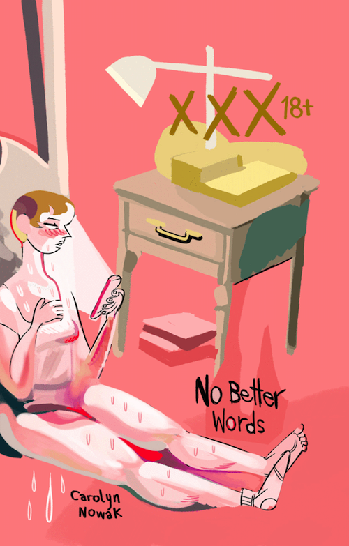
It's a rare pleasure to find a comic this purely horny. Nowak has colored No Better Words in pastel pinks and purples, and the subtle blush on the young woman’s cheeks say more than any of her hormone-fueled metaphors ever could.
If you’re young, or if you ever spent your youth in beer-soaked ragers hoping someone would come along and adore you the way you wanted to be adored, No Better Words is a fairy tale meant just for you. And if you look past the eager lips and the gauzy, semi-stupid stares, you’ll likely recognize the tragedy just nipping at the heels of all the yearning. It’s sexy because of that heartbreak, that emotional risk, not in spite of it.
Thursday Comics Hangover: Go climb Trash Mountain
Two days ago, former Seattle Weekly arts editor Kelton Sears made a very exciting announcement on Twitter:
I spent 2 years of my life making this longform GIF comic called Trash Mountain. You can see it at https://t.co/d2jNTanqWU. I hope you like it. You can view it on your phone, but it's best on a computer/tablet. Turn your sound on if you want the soundtrack. Warning: ~Male Nudity~ pic.twitter.com/tlbS61CZfU
— Kelvin Spears (@KeltonSears) May 22, 2018
Trash Mountain is now available to read for free at trashmountain.cool. It’s a GIF comic with an autoplay soundtrack, and it does contain some (highly cartoony) nudity, so you might not want to read it at work.
But you should definitely read it. This thing is beautiful: a blend of cartoons and comics and collage and photography. Our main character wakes up to find a stereotypical greedy CEO about to destroy his home for the sake of exploiting some natural resources.
The plot is incredibly simple — too simple, if I’m honest — but a comic like this is all about the journey, not the action. The sequence in which our protagonist tries to meditate on the surface of a gorgeous sunlit body of water only to be distracted by internal noise (a Facebook feed, a winking nude woman, a scrappy black cloud, a meta panel of him picturing himself picturing himself picturing himself) is a perfect example of why anyone should want to read a comic made entirely out of animated GIFs.
Trash Mountain takes a little getting used to: it’s hard at first to read a comic when every one of the panels moves of its own accord. But once you acclimate to the jittery rhythms of the book, the comic unfolds itself to you in a pleasantly soothing sort of way. The glitchy, trance-y soundtrack loops itself around and around again, and your eyes glide across the panels, like a babbling stream over rocks.
Ultimately, Trash Mountain is about finding your people, and fighting crass capitalism with tools of spirituality and authenticity. It’s a beautiful, strange book, an eternally moving handmade minicomic slapped up on the Worldwide Interwebbing, just waiting for its audience to come and find it. If you happen to be a Trash Mountain kind of person, this comic will sing to you in a language you never knew existed.
Thursday Comics Hangover: A Deadpool comic for people who hate Deadpool Comics
Last week I did something that I have never done before: I went into a comic book shop and I paid money for a pair of Deadpool comics. Even more embarrassing: I read them and I loved them.
Deadpool never really clicked for me. His breaking-the-fourth-wall schtick is rarely handled well and I like my superheroes to have moral codes. I don’t think the character represents an age of decadence in superhero comics or anything histrionic like that. I don’t begrudge Deadpool fans their hero. I just don’t think he’s funny or original. (And the Deadpool movie, whose sequel is in theaters tomorrow, seemed remarkably on-brand in that way: I didn’t think it was especially funny or smart, but it really clicked for certain audiences.)
But Marvel Comics is glutting comic shop shelves with Deadpool comics to cash in on the new movie, and one of the miniseries they’re publishing is titled You Are Deadpool. If you’re interested in playful experimentation in the comics medium, you’ll want to pick this one up — even if you’re not a Deadpool fan.
You Are Deadpool is a choose-your-own adventure comic. The way it works is this: every panel in the comic is numbered. Whenever Deadpool faces a dilemma, the reader can choose which way to go, and each decision sends them to a different panel. “If you’d like me to have a flashback,” Deadpool tells the reader in the first issue, “go to 72. Alternatively, if you’d rather get right into it, go to 66.” It’s not all fight-oriented; later in the series, readers get to choose whether Deadpool shares his emotions through painting (“go to 16”) or poetry (“go to 14.”)
There are more rules, too — “cool” violent actions increase Deadpool’s Badness Score, while crawling through tunnels adds to his Sadness Score. And readers can “play” combat in the book by rolling dice to determine the outcome of certain battles. But readers can also “cheat” and barrel through the book, flipping back and forth to see the outcomes of various actions.
The big difference between this Deadpool book and every other Deadpool comic is the writer, Al Ewing. Ewing has as close to a perfect record as any Marvel writer — he writes stories that reflect back on decades of Marvel history while also pushing forward into new concepts and, in this particular case, storytelling techniques.
But every comic is a collaboration, and Salva Espin’s artwork in issue 1 is a terrific complement to Ewing’s script: his art is clear and just cartoonish enough to sell the ludicrous premise. Paco Diaz’s art in issue two — in which Deadpool is zapped back in time to Marvel’s earliest days to riff on the Fantastic Four’s origin — is a little stiff for my tastes, although Diaz does do a pretty good riff on early Marvel art.
I’m a sucker for this kind of formal play, and I have to begrudgingly admit that Deadpool is exactly the right character for this kind of a story: his ability to address the reader directly helps guide novices through the book, and his unpredictable amoral tendencies make him a believable audience surrogate for every course of action.
You Are Deadpool hasn’t converted me to a hardcore Deadpool fan, but it has opened up my understanding of what the character is capable of doing in a story. Ewing’s excitement for the possibilities of the medium prove that old adage about how in the right hands there’s no such thing as a bad character. You Are Deadpool proves that Ewing’s hands are abler than just about anyone in mainstream superhero comics.
Thursday Comics Hangover: What he's fighting for
With a very few exceptions, superheroes have always been portrayed as defenders of the status quo. It's a superhero's job, at the end of the story, to return the world to something like the condition they found it in at the beginning of the story. On a very basic level, they're opposed to change and to protest and to evolution.
You can't help but feel bad for Jason Fisher, the jetpack-wielding superhero at the heart of screenwriter John Ridley's comic The American Way: Those Above and Those Below. Fisher is doing his best to save lives and serve the law. But as a Black man, Fisher is held to standards that white superheroes like Batman avoid. When Fisher catches an armed Baltimore radical in the first pages of the book, the Black residents of the neighborhood immediately label him a "sellout."
It only gets worse from there. Someone else calls Fisher "a traitor" and "a tool of the money class." And when a Black man calls him an "Uncle Tom," Fisher snaps back: "Read the book. He died protecting people. What the hell did you ever do?" Set in the 1970s, Those Above and Those Below is a deeply political story about revolutionaries and burnouts and everyone else who falls in between.
As you might expect from the writer of 12 Years a Slave, Ridley's script is taut and nuanced: you won't find a bunch of obnoxious 1970s references added in for unnecessary atmosphere. It's very obvious that America is being torn apart in this book, but Fisher doesn't have to yammer on about the Nixon Administration's excesses to convey the paranoia or the claustrophobia of the time. The art, by Georges Jeanty, is dense and detailed. I'd like to see a little more attention to facial expressions and physical differences between characters, but the action is clear and the storytelling is impeccable.
If you enjoy a good superhero story that doesn't shy away from the weird politics of the genre, you'll very likely enjoy Those Above and Those Below. But it's not the cynical, Frank Miller-style deconstruction of the genre you've come to expect from "adult" superhero stories, either. At the heart of the story, Fisher's decency shines through: he's someone who wants to help, and who doesn't shy away from the question of whether his help is wanted — or even needed. More superheroes should ask themselves that same question.
Thursday Comics Hangover: Some recommendations for Free Comic Book Day
This Saturday is Free Comic Book Day, and you should absolutely pick up some free comics. But as I say every year, if you regularly shop for comics at comics shops, Free Comic Book Day isn't free. These comics may be free for customers, but theystill cost money for comics shop owners to buy, so it is your responsibility as a comics reader to help the comics shop absorb the expenses of the free comics by buying a few comics of your own. I like to use the day to pick up some trade paperbacks I've failed to pick up over the course of the year, for instance.
Don't know which books to buy? Allow me to help! Here are some of my favorite recent paperbacks:
- From local publisher Fantagraphics, I really dug the horror anthology Flayed Corpse, written by Josh Simmons and drawn by a host of other artists — many of whom live here in Seattle. And speaking of Seattle cartoonists, Ellen Forney's brand-new book Rock Steady is a heartfelt guide to staying calm and centered in moments of emotional crisis. (Forney will be reading and signing at the Fantagraphics Bookstore and Gallery on FCBD, so you can get an autographed copy for no extra charge.)
If you're looking for something for younger readers, I wrote about two exceptional new young adult releases from First Second just last week.
I can't stop thinking about Anneli Furmark’s comic Red Winter, which is about trying to find common ground in a nation torn apart by politics. I think when all is said and done, this could be one of my favorite books of the year.
Can't afford a trade paperback? Here are a few monthly issues that have been especially interesting lately: the first chapter of the utopian Old Woman Laura story in All-New Wolverine is a great kickoff to a promising new storyline that de-grims an awful (and awfully popular) Wolverine story; the Clowes-ian Miami noir of Dry County; and the first couple issues of the engaging historical Harlem-set mystery Incognegro: Renaissance.
In the mood for work from local cartoonists? Look for Katie Wheeler's personal diary comics; The City, which chronicles a fictional European city in between world wars; and Brett Hamill's very funny gag strips.
And lastly, if you liked the trippy cosmic energy of the Infinity War movie, you should definitely check out the reprints of Phillipe Druillet's Loan Sloane comics series, especially the latest installment, Gail. The goings-on in that book make Infinity War look like a comic book convention in comparison.
Thursday Comics Hangover: Telling the stories that young readers need to hear
First Second is quietly becoming one of the most consistently enjoyable comics publishers in the industry. The publisher doesn't get a ton of attention in the mainstream press — possibly because it focuses primarily on young adult comics — but readers have taken notice, and librarians have fallen in love with their books. I've recently spent time with two First Second releases, and they're entirely delightful — fun, heartfelt examples of comics as a storytelling art form.
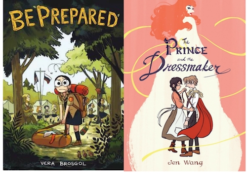
Jen Wang's The Prince and the Dressmaker is a fairy tale romance with a modern twist: a poor young woman wants nothing more than to design and create beautiful gowns. She's plucked from obscurity by a prince to create the dresses of her dreams, but the catch is that they're for the prince himself to wear.
Wang's handling of the prince's need to dress as a woman is note-perfect. It's not a curiosity, or a perversity; it's just who he is. And while he encounters adversity when he heads out on the town as Lady Crystallia, it doesn't really spoil anything to say that Prince is a fairy tale romance with happy endings for all. This is a gentle, kind-hearted love story about being who you are and loving someone else for who they are.
The cartooning in Prince is all about faces: the faces of gossiping society girls at the ball, the pining face of the prince, the worried face of the dressmaker. All the pointing fingers and swooping dresses and bolts of luxurious fabric on every page points to the expressive faces of the characters. Wang is adept at drawing fashion that inspires delighted sighs from her readers, but the real secret to the liveliness in her art is in the mooning eyes and the cocked heads of her characters.
Portland cartoonist Vera Brosgol got her start at the stop-motion animation company Laika, and her brand new memoir-ish comic Be Prepared speaks to those animation roots. The book, about a young Vera getting shipped off to a Russian-language camp for the summer, doesn't contain any of the splashy action sequences of, say, Kubo and the Two Strings, but when Vera wanders through the woods, you can feel her location in space: Brosgol seems to know where every last tree in Camp Orra is located. It feels as real and as solid as the park closest to your house.
Young Vera is a bit of an outcast; she's too young to identify with her adolescent tentmates, and she's too smart to fall for the phony camraderie of awkward friendmaking games. So she gets lonely and she worries that she'll never fit in anywhere.
Be Prepared, thankfully, doesn't suddenly transform Vera into a social butterfly, and it doesn't promise that every childhood hurt will magically heal. But it does promise that if you hang on long enough, things will get better — and that's just the message that kids need to hear.
While the big two comics publishers struggle to appeal to young adult readers with big-eyed cutesy versions of the same old superheroes, First Second is speaking to young readers on their own terms, and telling new twists on classic stories. Forget Archie comics — First Second's are the comics that will inspire future generations of cartoonists to pick up their pens and start doodling.
Thursday Comics Hangover: Nancy gets fancy
On April 9th, a new cartoonist using the pseudonym "Olivia Jaimes" took over the daily Nancy newspaper comic strip.
The Nancy strip has often been a bastion of anti-art. Ernie Bushmiller's original Nancy comics were always so vacant in plot and in ambition that they practically demanded readers to fill them with meaning. They looked so clean and neat and geometric that they appeared to be untouched by human hands, and the behavior in the strips bore no resemblance to real life. Nancy and her friend Sluggo didn't act like people. They acted like characters in comic strips. They went to soda fountains and hung around butcher shops. They said things that could only make sense if you were saying it to telegraph a punchline in a comedy bit.
The Nancy strip has always been a postmodern joke about comic strip jokes, a strange antiseptic world so generic that you wouldn't be surprised to find that Nancy's word balloon in the last panel of any given strip read "INSERT PUNCHLINE HERE." After Bushmiller passed away, artists like Jerry Scott and Guy Gilchrist tried to capture Bushmiller's odd sense of humor, but they mostly succeeded in creating a generic comic strip about a little girl who was kind of a dick and her weird dumb bald friend.
Jaimes, though, adds something new to the strip: a perspective, style, and voice. Most of Jaimes's strips so far have had to do with modern life. There's an awkward earbud joke, and a few jokes about social media. (In one self-referential panel, Jaimes intrudes to say that "Any questionable art from now on is because Nancy and Sluggo are using a Snapchat filter.") But the best of the strips trade on Nancy's long history of self-absorption. Nancy admits to Sluggo that her goal in life is "to be famous without having to work," for instance.
My favorite of Jaimes's work so far was published on Tuesday, and it manages to combine Nancy's horrid lack of self-awareness with a fairly up-to-date topic: social media bots.
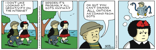
That last panel, with Nancy's resentful face and the absurdity of Sluggo-bot, is just about perfect. Obviously, real people directly in front of you can't be bots, but Nancy can't fathom dissent and so she questions her friend's free will. You could almost picture our president appraising a reporter with this same entitled sneer on his face.
Nancy fans — and yes, there were some — naturally hate the new stuff. On the sit GoComics, Lambert2015 commented on the above strip:
I just can not get into the new Nancy..just not what I enjoy reading with my breakfast. Bye, I will unfollow this comic
And someone named Chirp writes:
I don’t like this crap and just unfollowed this destruction of a 70 year old comic strip. Millennials, IF they read comics, will LOVE the fact that the RACE of 1 of the main characters has now been changed. I wonder when their sex lives will?
I have no idea what Chirp is talking about with regard to race — perhaps they're referring to the strip's new color palette, which uses more browns and yellows than past Nancy strips? If so, yikes.
And the complaints just keep coming. A user named JLG complains, "So far, this new version of Nancy seems rather unfocused and hard to really sink your teeth into," as though you could really devote three or four hours to the substance of a single Nancy strip by Gilchrist or Bushmiller.
Any change on the comics page always evokes a litany of complaints from hardcore fans. Comic strip followers seem to be a pretty conservative bunch, and they absolutely hate change. But the hate Jaimes is receiving is something else again — you'll find a lot of men in the comments raging against her and claiming that she was just an affirmative action hire and needs to be replaced, presumably by a man, immediately.
As for me, I'm a big fan of Nü Nancy. I think the strip is calling back to Bushmiller's bone-dry sense of humor, and Jaimes's idiosyncratic art is endlessly appealing. She's got Bushmiller's sense of minimalism down, but now Nancy looks like an alternative comic. It's a vastly different interpretation than Bushmiller's — weird and wavy as opposed to angular and antiseptic — but it works perfectly in this most meta of comic strips. I'm willing to bet that in six months, the haters in the comments will either have moved to a conservative comic strip (do they still make Mallard Fillmore? If so, why?) or they will have died of old age. We're seeing the eternal struggle between baby boomers and millennials playing out on the comics page, and the sheer weight of time indicates that you should probably put your money on the younger of the two.
Thursday Comics Hangover: The unexpected terror of Josh Simmons
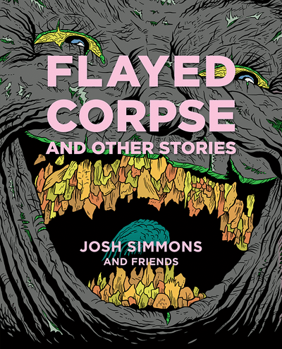
Josh Simmons is continuing a proud comics tradition of grossing people the fuck out using graphic violence and inappropriate humor. His books read like modernized, literary versions of those schlocky old EC Comics that came out back before the Comics Code Authority turned the freewheeling world of comic books into squaresville.
This Saturday at the Fantagraphics Bookstore and Gallery, Simmons will be onhand to present his latest book, Flayed Corpse, which is a kind of one-man anthology written by Simmons and drawn by a passel of artists. (It's fitting that the book is launching in Seattle, since Corpse is a book with deep Seattle roots, too: artists include Seattleites like Eroyn Franklin, Ben Horak, Tom Van Deusen, Pat Moriarty, and Fantagraphics editor Eric Reynolds.)
It probably goes without saying, but this book isn't for everyone. In the second story, a slasher stalks a pair of nubile young women. "…I'm in need of a sweet, slow sexin'," one of the women announces while in the hot tub. "I could go for a slice of the ol' dick myself," the other replies. The story ends with an explicit, gory sex scene that would probably get the book banned in Alabama if a library mishap resulted in a copy of Flayed Corpse winding up in the wrong kids' hands.
But Corpse doesn't feel like a book that's out to get banned for the sake of cheap publicity. Simmons's intent is different than the intended-to-shock vibe of, say, a Johnny Ryan comic. He's genuinely interested in the vocabulary and cadence of horror comics - stretching out a tense scene using longer panels, or a spray of tiny panels to build up suspense, even while the plots of the stories resist the many clichés of the genre. There's no violence in the story by Simmons and Franklin - it's a literal day at the beach - but it's a genuinely unsettling tale in which the threat of violence is palpable in every day-glo panel.
Not every story is a horror show; some are quite amusing. In "Late for the Show," Simmons and Van Deusen draw an enormous manchild going on a cop-killing rampage on what appears to be the Boren overpass. In "The Great Shitter," Moriarty and Simmons tell the story of a giant Godzilla-like creature that eternally eats and shits onto a small town that devotes generations to feces removal. "The shit is pushed out to the river, where it washes away. We all keep our heads above the shit flow and live to work the shit show another day." It's an allegory for jobs like fracking and coal mining that destroy the environment, sure, but it's also a funny story about monsters and poo.
Like the best anthologies, Corpse is interested in keeping you on edge, never quite sure of what's coming next. Hell, don't tell DC Comics, but Simmons seems to have snuck an actual Batman story into the book, somehow. Even just calling it a horror collection is doing it a disservice: Simmons understands that to scare a reader, you can't keep sending unrelenting darkness into faces for a couple hundred pages. True terror happens when you don't know what's going to happen next.
Thursday Comics Hangover: Flipping the bird at dystopian cynicism
I have written before about how much I detest Mark Millar's Old Man Logan story. It's the worst of modern superhero comics: cynical, try-hard, a crass rip-off of a significant pop cultural icon (Millar should have to pay royalty checks to Clint Eastwood for what he did to Unforgiven.) Somehow the series, which imagined Wolverine living in a dystopian future in which the Hulk breeds with his cousin to father a posse of inbred hulkbillies, managed to inspire Hugh Jackman's final Wolverine movie, Logan - a film with all the heart and thoughtfulness that the original series lacked. But that's the only good thing to ever come out of Old Man Logan
Until now. The 33rd issue of All-New Wolverine, which follows the adventures of Wolverine's younger female clone Laura, kicks off a new storyline called Old Woman Laura. Written by Tom Taylor and illustrated by Ramon Rosanas, this series seems to be a direct response to Old Man Logan - a critique and a call to better superheroic storytelling.
I haven't read a single issue of All-New Wolverine before this one, but I could still easily follow the action. Laura - a character that almost everyone knows, thanks to Dafne Keen's heartfelt portrayal in Logan - is a national leader in a utopian future. She's mentoring an even-younger clone of herself, Gabby, who has taken on the Wolverine name for herself. (This is not the ugly, grim Wolverine of the 1990s: Gabby makes her grand entrance in the comic by groaning at the bad guys, "Urgh, you're the worst.") Laura learns that her time on Earth might be numbered, so she decides to fix the two biggest mistakes from her past: give one person a second chance, and kill another person who escaped justice.
Where Old Man Logan was nasty and mean, Old Woman Laura is fun and compassionate. "We fought against greed and hate and fear. And we actually made the world a better place. The heroes won," Laura announces in the first few pages. It's accompanied by a cityscape drawn by Rosanas that shows glimmering towers and huge expanses of vegetation, all in lush shades of green. It's a beautiful world - one that laughs in the face of Old Man Logan's loathsome dustbowl.
Of course, things could go wrong between this first issue and the end of the Old Woman Laura storyline, but Laura's quote above seems to be the mission statement for the book, a refutation of the cynical worldview espoused by Millar in Old Man Logan. Millar argued that even if heroes did their best, they'd still lose because the natural order of things is to decay and turn sour. Taylor and Rosanas seem to take Millar's vision into account, talk amongst themselves, and then reply, "yeah, fuck that." I'm with them.
Thursday Comics Hangover: You belong to The City
Why are fictional cities such a common trope in comics? More than any other art form, comics seem to make it easy to create locations with their own unique spirit. Compare Metropolis in the Superman comics with the Metropolis of any of the Superman movies, for instance, and you'll see how hard it is for film to duplicate the world-building of the comic books. In just a few panels, artists can give Metropolis its own flavor: an art deco city of the future, with flags and golden sunlight everywhere.
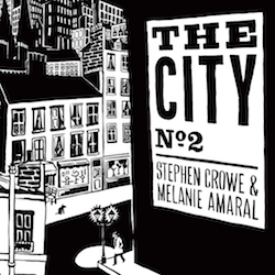
In the second issue of a comic titled The City, Seattle cartoonists Stephen Crowe and Melanie Amaral are hard at work creating a fictional city of their own. Set somewhere in Europe, and sometime between World War I and World War II, the titular city is going through that awkward civilizational phase. It's old enough to have a monarchy, for instance, but modern enough to not know what to do with a king. The first story in The City 2 is about a king returning after a long absence, only to find his grand return foiled by moronic bureaucrats. "The King's coming tomorrow," a border guard tells the king's assistant in front of the king, "We got a memorandum about it. It's going to be a big show. We've got all the bunting in, haven't we?" "Oh, for heaven's sake," moans the king as a second guard shows off a box full of bunting for his arrival. It's a dry and funny story that wouldn't be out of place in a Monty Python sketch.
The City is made up of small vignettes which are related only by theme and setting. (You don't need to have read the first issue at all to enjoy the second issue.) Elsewhere in the city, a pair of academic revolutionaries quibble over the name of their new literary magazine. Elsewhere, some elites are anxious at the prospect of eating ethnic foods. In between the stories are advertisements for a grand hotel ("An impenetrable fortress of privilege in the heart of the city," the ad swoons) and other gorgeous artistic flourishes.
The artwork here is beautiful, recalling the whimsy of Kate Beaton and the elegance of old New Yorker cartoons. The dialogue is appropriately stuffy, with pompous characters setting the stage for their own comeuppance. The biggest complaint I have with The City is relatively small - the lettering in one story at the end of the issue is sloppy and difficult to read. In contrast with the delicate lettering in the rest of the issue, those airy balloons and ugly cursive captions feel more amateurish than everything else.
But fans of literary comedy will be over the moon while reading The City 2. You'll find elements of Kafka and Stefan Zweig throughout. Amaral and Crowe expertly capture that sensation of the time in Europe in between World Wars, when civilization was barely containing the bestial angst just beneath the surface. Sure, people dress in fancy clothes and speak with the utmost politeness, but you expect that at any moment all the finery and shiny medals might disappear in a whirlwind of chaos. There's not much difference between an upright citizen and a cornered animal - just a uniform or a fancy dress is all that's holding us together.
Thursday Comics Hangover: The personal touch
Now that Facebook is burning down, maybe it's time to learn how to interact with other people again. Maybe you should try to figure out how to write letters. Maybe you've fallen so into the habit of bragging on social media that you don't remember how to tell people honestly about how your day was, or what you think or feel about things. Maybe we all need to learn how to communicate again.
This week, I've been reading Small Careful Fires, a collection of non-fiction comics by Seattle cartoonist Katie Wheeler. They've helped me feel more human in a week when the news is making me feel like nothing more than a predictable set of consumer choices on some website somewhere.
Fires is a collection of strips that read like diary entries. They're little moments, captured and curated with care: Wheeler cooks lunch, she goes to yoga, she and her husband consider adoption. Wheeler's art is intimate and warm. On every page, she letters with a blend of print and cursive that delivers a handwritten vibe.
Some of Wheeler's panels are descriptive, showing the plants in her apartment in close detail. Other panels are more abstract, depicting her anxieties as an ominous doorway to "a room of worries in [her] mind." A few panels are crammed full of words, like when someone tries to tell you a story they're so excited to share that they start talking really quickly.
Wheeler uses color to great effect in Small Careful Fires. Each anecdote is told in shades of a single color. The strip about anxiety is laid out in shades of blue, the strip about tending plants is green. The color creates an atmosphere for each story, giving each turn of the page some added excitement.
Reading Small Careful Fires in this exact moment was important for me: it reminded me that there's more to communication than what we can cram into Facebook's text boxes. Wheeler's autobiographical strips are so open and funny and inspirational and inviting that they'll make you want to share something of yourself, too — something real. Something human.
Thursday Comics Hangover: Miami vice
I came late to cartoonist Rich Tommaso's work - the first comic of his that I read was the funny-animal Tintin pastiche Spy Seal - but I think I'm falling in love. His art is so clean, his storytelling so economical, that it seems like it's just a matter of time before one of the mainstream publishers shows up on his front lawn with a dump truck of money and forces him to start drawing Batman for a living. Tommaso is an artist who is so unique that the comics industry is bound to try to crush him into something they can more easily manipulate.
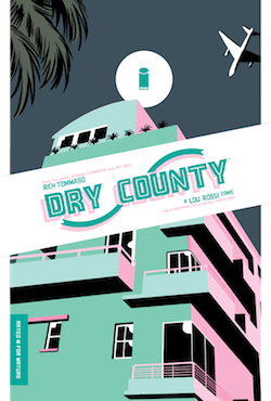
Yesterday, I picked up the first issue of Tommaso's latest series, Dry County. It's a sunny Miami noir story about a guy who meets a woman and falls into really deep shit really quickly. (Sidebar: does any noir ever take place in a dark and rainy city anymore? Seems like every noir nowadays is located in Florida or California, and is always described with the word "sunbaked.") Tommaso is using a different style here than the slick European look of Spy Seal: Dry County looks almost as though it's drawn by Dan Clowes. Every face is a little bit…off…with too-small eyes or a crooked nose or a smile that twists the wrong way across someone's cheek.
The narrator, a cartoonist named Lou Rossi, is a misanthrope. He lurks around Miami, sweating too much and trying to drink himself to some sense of peace. Then, he runs into someone in a laundry room. Her. "A blonde goddess," Rossi calls her. Of course, there's trouble. She's in an unhappy relationship, and it's been a long time since Rossi's been in a relationship, and things start to go bad quick.
There's nothing too original in the plot, but every page of Dry County brings a new delight with it. Rossi has a friend named Robert, for instance, who seems to have wandered in from a pornographic Popeye cartoon a few books over. The opening splash page of Rossi wandering around a rave is practically the dictionary definition of what it feels like to be alone in a crowd. And a gorgeous two-panel sequence of Rossi day-drinking on a porch as he stares out onto a pastel-colored Miami street will leave you drooling.
I don't know where Dry County is going, but Tommaso has proven to be such a phenomenal talent that I expect the book to keep up this delight-on-every-page spirit until the bitter - and no doubt sunbaked - end.
Thursday Comics Hangover: The shaggy depths of outer space
One of my favorites from that time was Jim Starlin's Adam Warlock series, a blessedly self-contained adventure of a space messiah who ultimately had to confront his twisted mature self. (In the 1970s, the Warlock story had a beginning, middle, and end, which was a rarity in serialized superhero comics. In the 1990s, Starlin revived Warlock and put him back on the intellectual property merry-go-round. As far as I'm concerned, the character stayed dead.) The book was visually wild, conceptually bold, and as cerebral as it was fun.
What I didn't know when I first read those cosmic superhero stories was that in 1970s France, an artist named Phillippe Druillet was creating a line of wild cosmic adventures that made its American counterparts seem as pedestrian as a Garfield comic strip.
Gail is a sexy, vivid fever dream, a story of pure evil trying to exert its will on the universe. The panels are angular and detailed down to the very last millimeter: a dimension of fractal skeletons; an emperor languishing on a throne in the aftermath of an orgy; a foreboding castle that stretches miles into the stratosphere, with a real photograph of a woman's face embedded into the front of it.
Our hero, Sloane, is not as grandiloquent as some of Marvel's more pompous cosmic heroes ("Go fuck yourselves!" he roars at the bad guys at one point.) But he's every bit as tenacious, venturing to the land of the dead to confront his opponents and upend the evil empire using just his wits and existential angst as weapons.
I'm not entirely sure what's happening at every point in the story, but that's not a strike against Gail. These cosmic books don't always follow the simple rules of cause and effect. Instead, they're examinations of what it means to be alive, to make moral choices in the universe, to carry the resonsiblity of existing. And Gail commits to the airy spirituality in a way that its American cousins could never manage. You'll never look at Adam Warlock the same way again after you read the adventures of his bonkers French cousin.